Member Content Pages Redesign
Systematizing member content entry points across 39 activity variations
DEVICE
Desktop (iOS/Android soon)
INDUSTRY
Healthtech
AUDIENCE
Organizational employees
SUMMARY
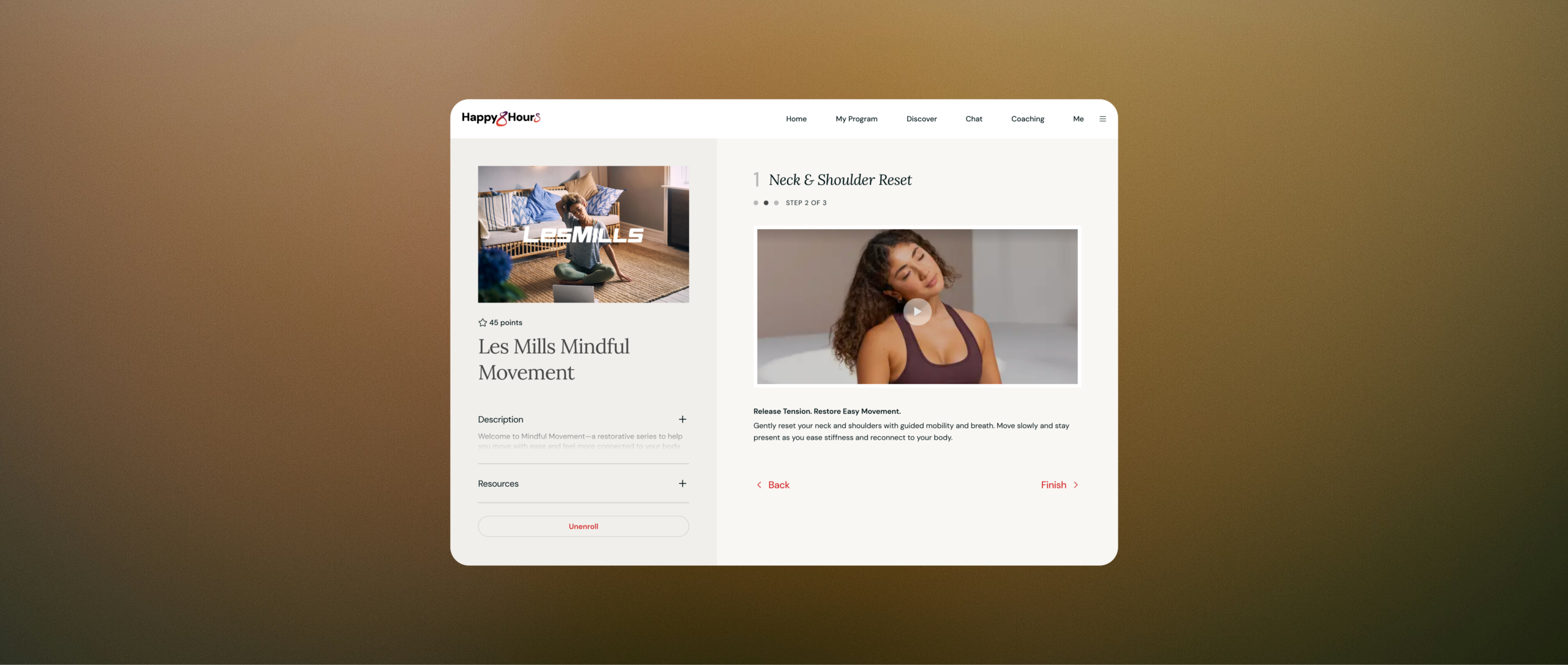
Aduro's member experience supports a wide range of content formats, from individual activities to multi-step paths and programs. Over time, content entry pages had grown into dozens of one-off layouts, making it harder for members to understand what they were viewing or what action to take next.
I led the redesign of these content entry pages, reducing 39 layout variations into a more flexible, system-driven approach. The result was clearer experiences across enrollment states and a foundation that could scale as new content types were added.
COMPANY
Aduro
DURATION / YEAR
Q4 2025, Q1 2026
STATUS
Eng handoff
ROLE
Lead Product Designer
CONTRIBUTION
End-to-end UX/UI · Research · System Architecture
PARTNERED WITH
PM · CPO · Engineering · Content Strategy
TOOLS
Figma · Mixpanel · Miro · FigJam · Usertesting.com
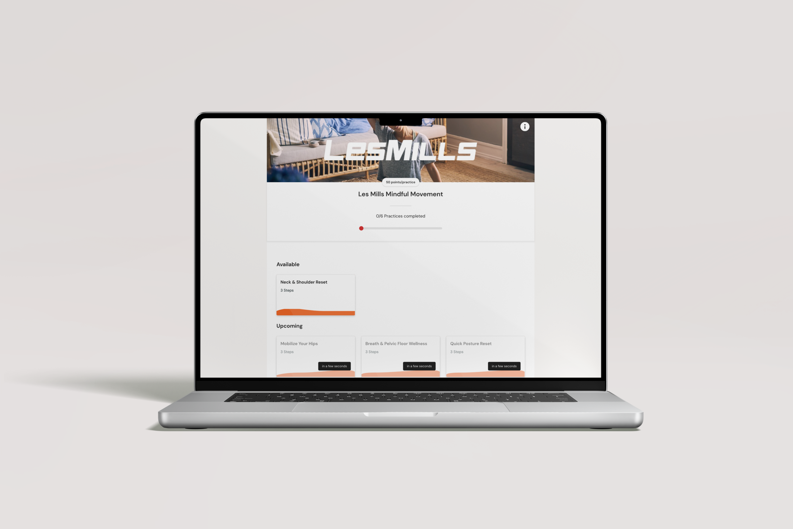
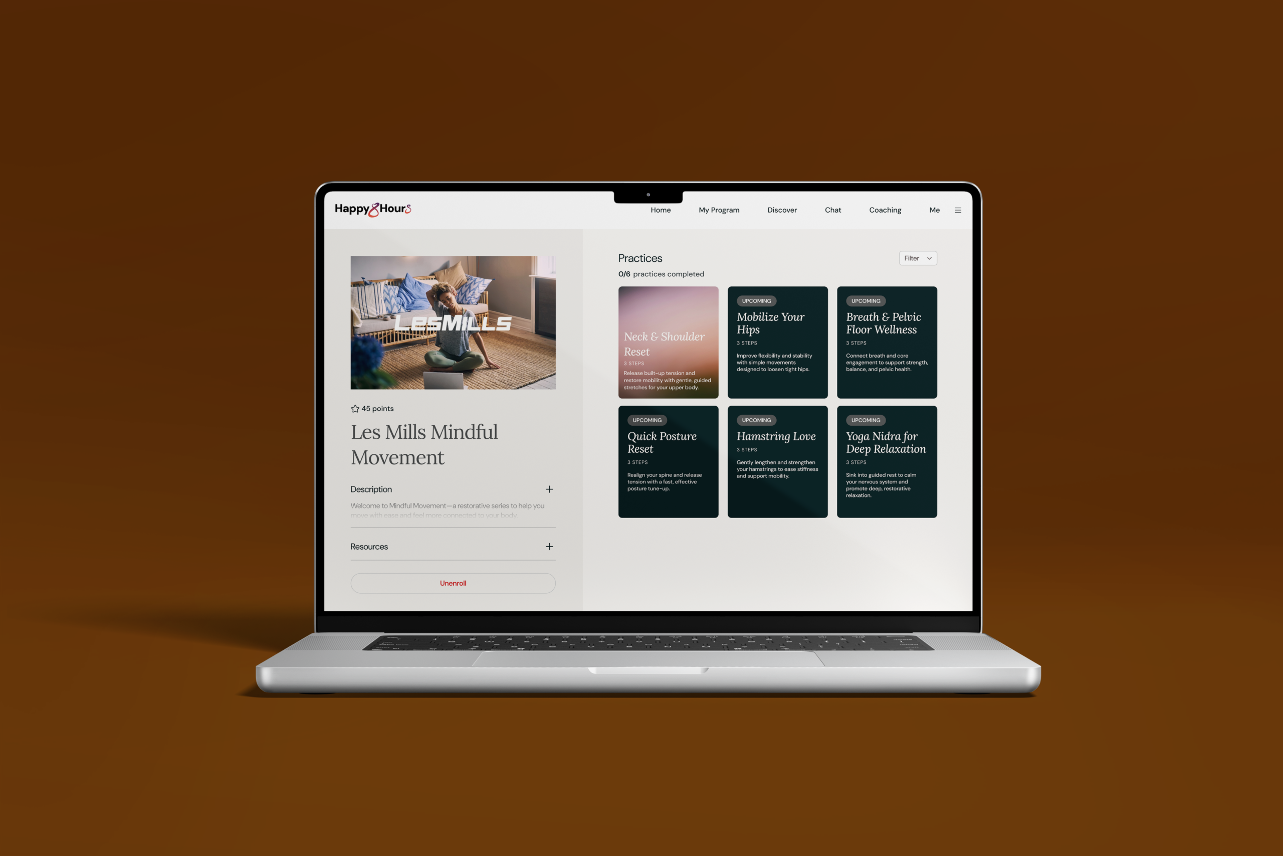
A quick look into a much larger redesign transformation: a content library with dozens of various templates.
Platform Context
Aduro’s member experience includes a wide range of content types, including activities, paths, mini paths, series, and libraries. Each content type can surface in different states, such as not enrolled, enrolled, in progress, or completed. As the platform evolved, these combinations resulted in 39 distinct layout variations, all serving the same core purpose: helping members understand what they’re looking at and decide what to do next.
Constraints
The primary constraint was designing within an already-live product, where new patterns had to work across 39 content variations without breaking existing member flows or delivery timelines.
Challenge
As Aduro’s content ecosystem grew, the pages members landed on after selecting an activity evolved organically, with each new content type introducing its own layout, logic, and edge cases. Over time, this resulted in 39 variations of content entry pages that looked and behaved differently depending on activity type and member state, making it harder for members to understand what they were committing to, what came next, or how progress worked.
Following the broader product rebrand, these pages also relied on rigid squiggle overlays that added visual noise without strengthening hierarchy, leaving the experience visually dated.
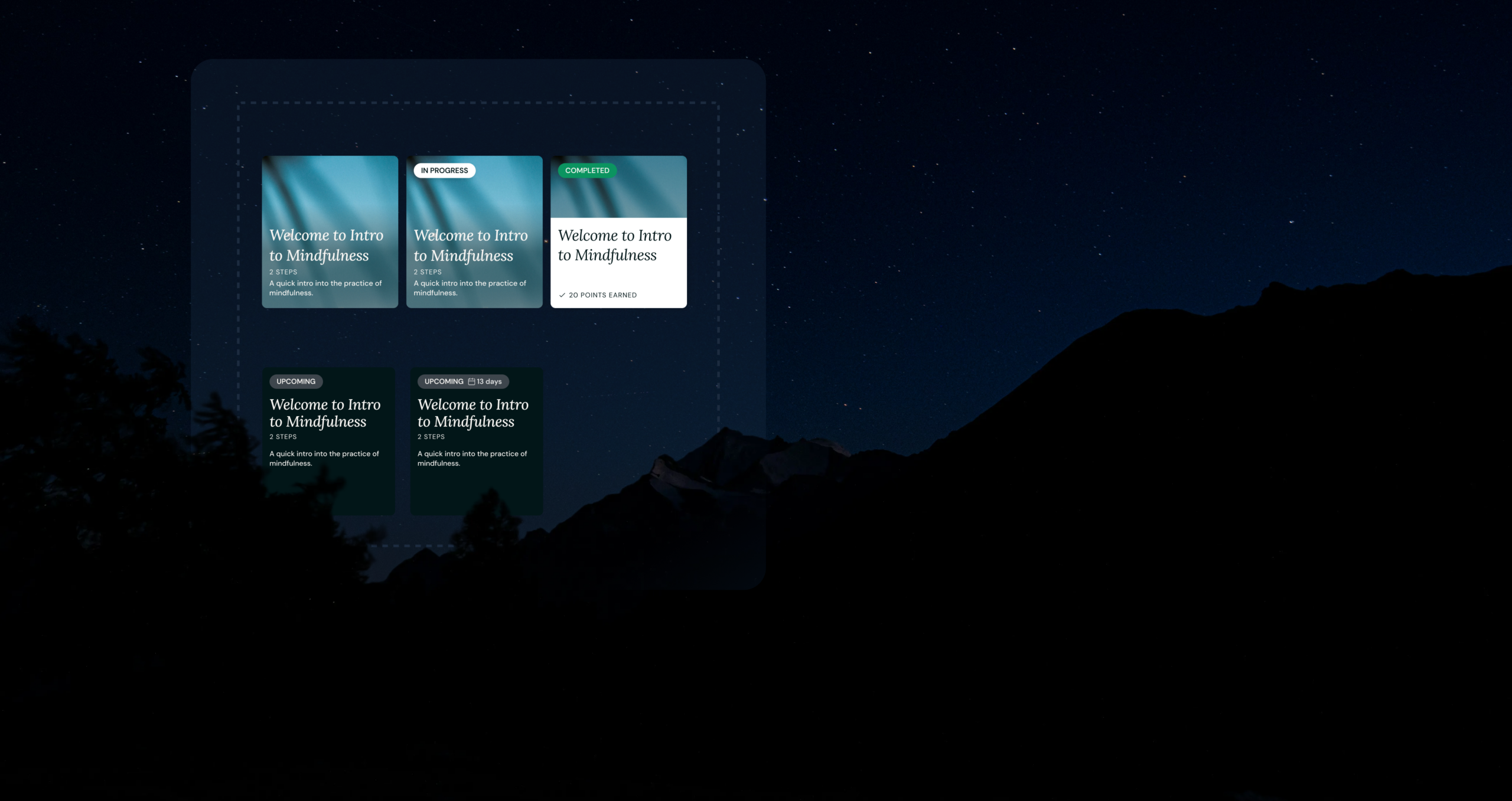
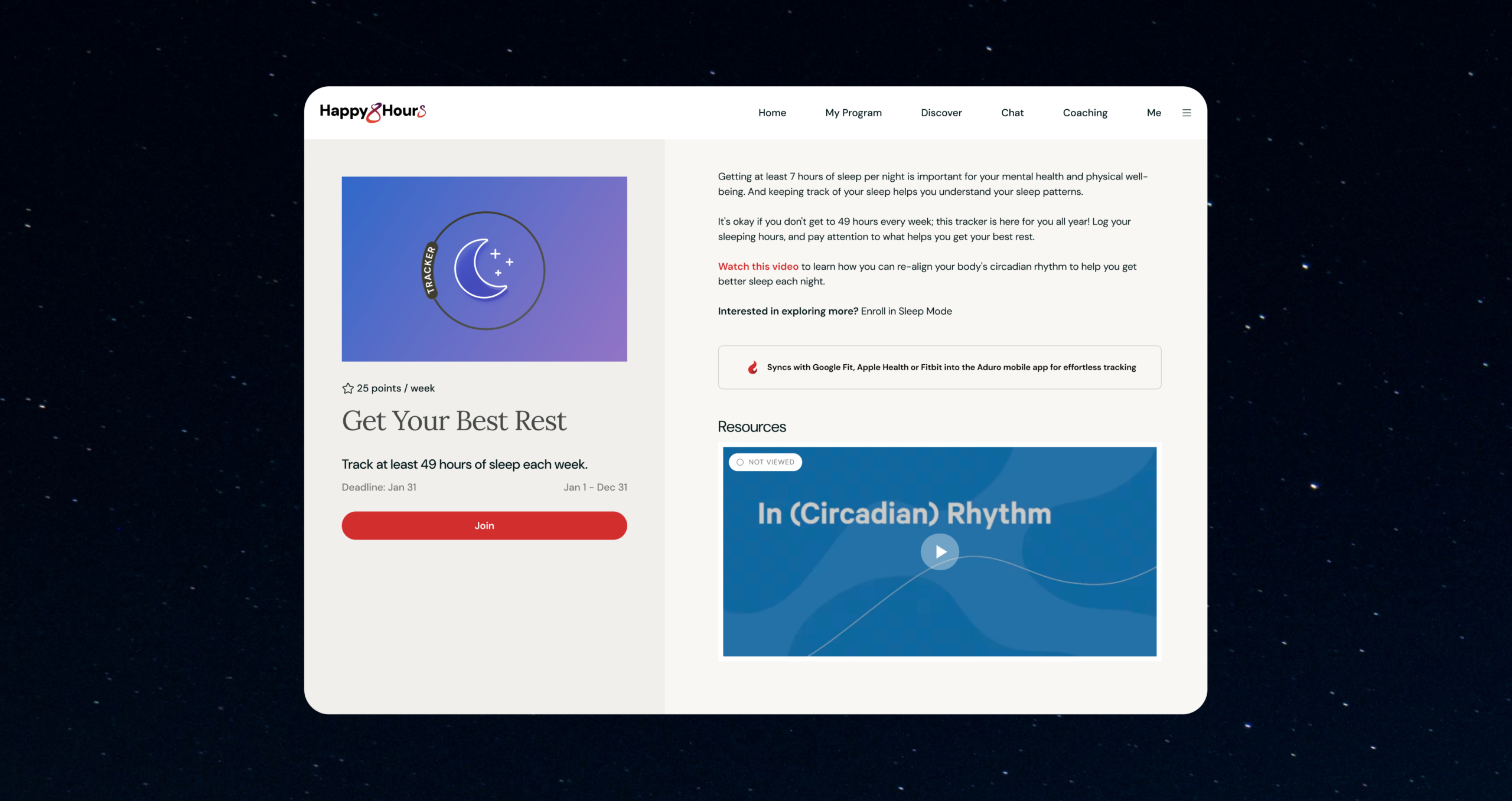
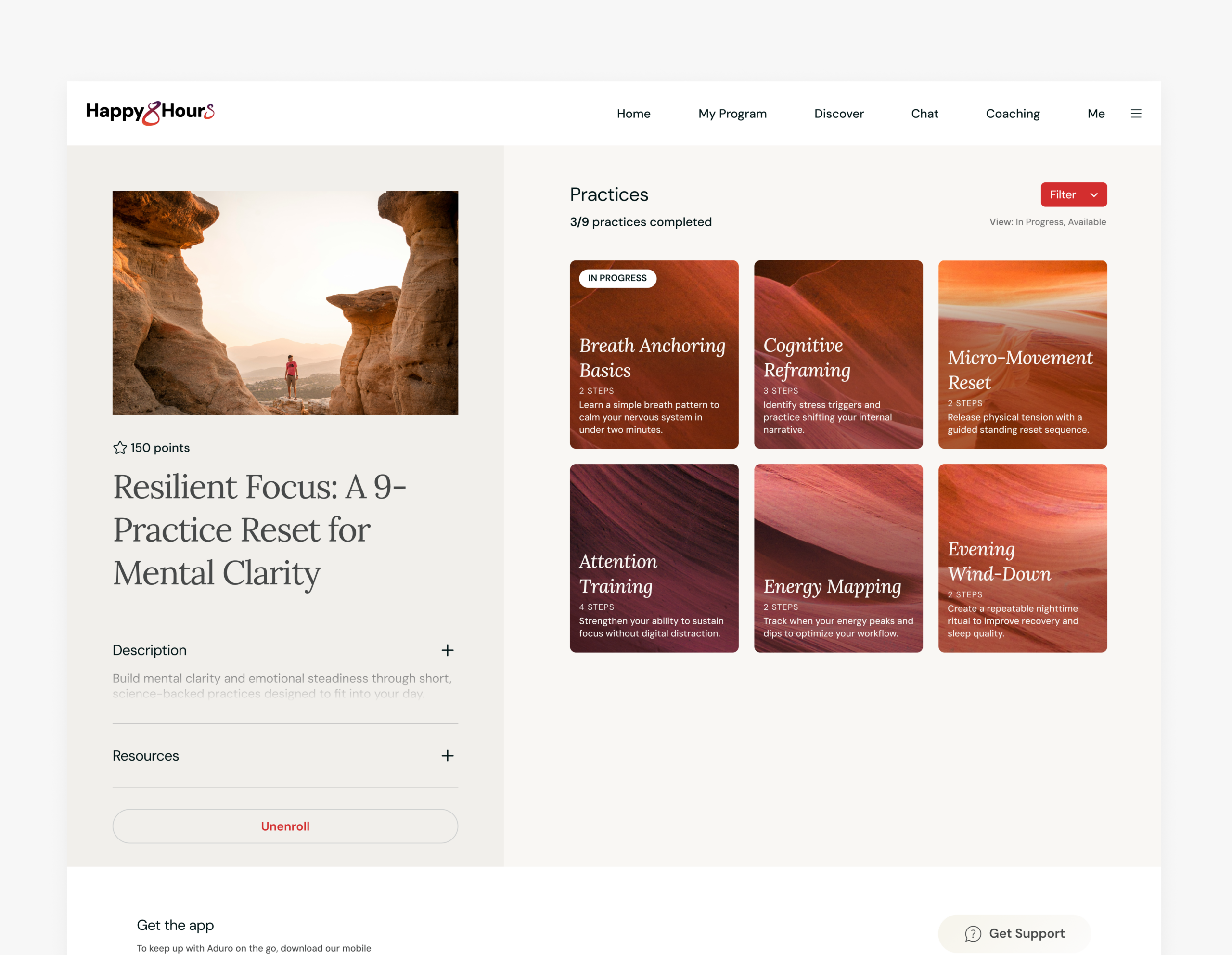
Some final component and layout designs for the content pages
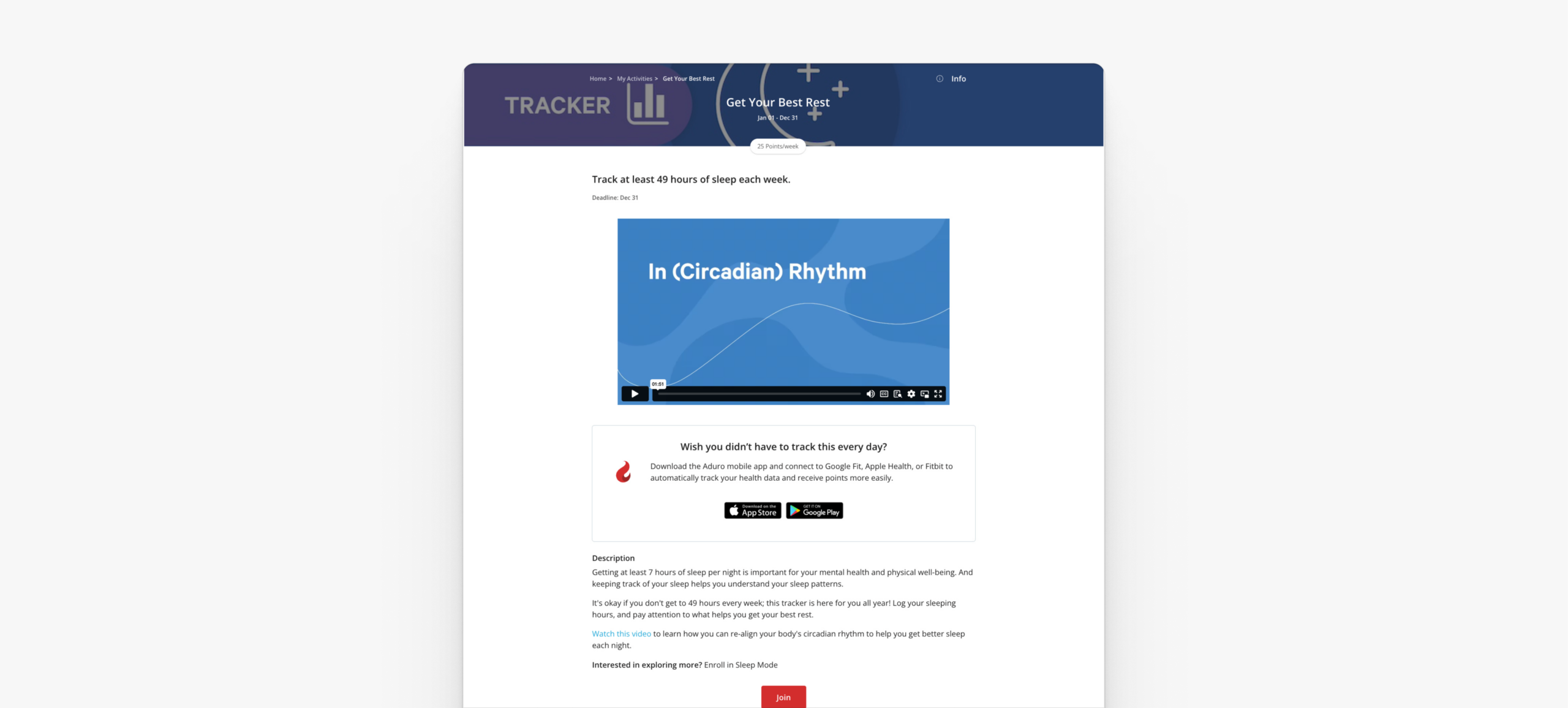
The original designs were 10+ years old and didn't incorporate the updated Aduro brand. Over time, supporting new content meant adding more layouts and logic, which made the system heavier and harder to maintain.
Goals & Success Criteria
The goal was to support a wide range of content types and member states without continuing to introduce new layouts for every variation, while giving members a clearer understanding of what a piece of content was, what commitment it required, and what would happen next regardless of activity type. From a product and visual perspective, success meant creating a scalable system that could accommodate new content and third-party integrations without increasing design and engineering overhead, while evolving the UI toward a more modern, expressive direction that reduced repetition across dense content grids.
Approach
Rather than continuing to design new layouts for every activity type and state, I defined a shared structure that could support variation without multiplying it, clarifying what needed to stay fixed for predictability and where flexibility could exist. For hierarchical formats like Paths, Mini Paths, Series, and Libraries, I modernized the visual language by replacing rigid overlays with a scalable system of organic gradients and abstract imagery, ensuring all 39 variations were accounted for within a single, system-driven framework before development handoff.
Component Considerations
To support a single rollout across all activity types and states, the system relied on a mix of refined and newly introduced components. Existing progress trackers were redesigned to better reflect enrollment and completion states across formats, while new shared components were introduced where patterns did not previously exist.
PROGRESS STATUS FILTERS
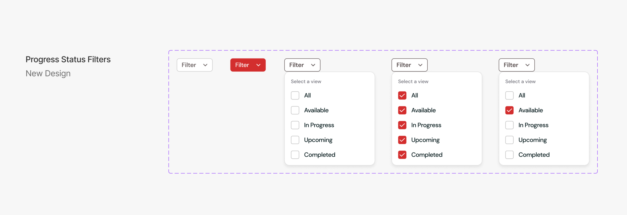
A single progress status filter allows members to quickly understand where they are across different content types, while giving the system a consistent way to handle enrollment and completion states.
PROGRESS TRACKERS
Before
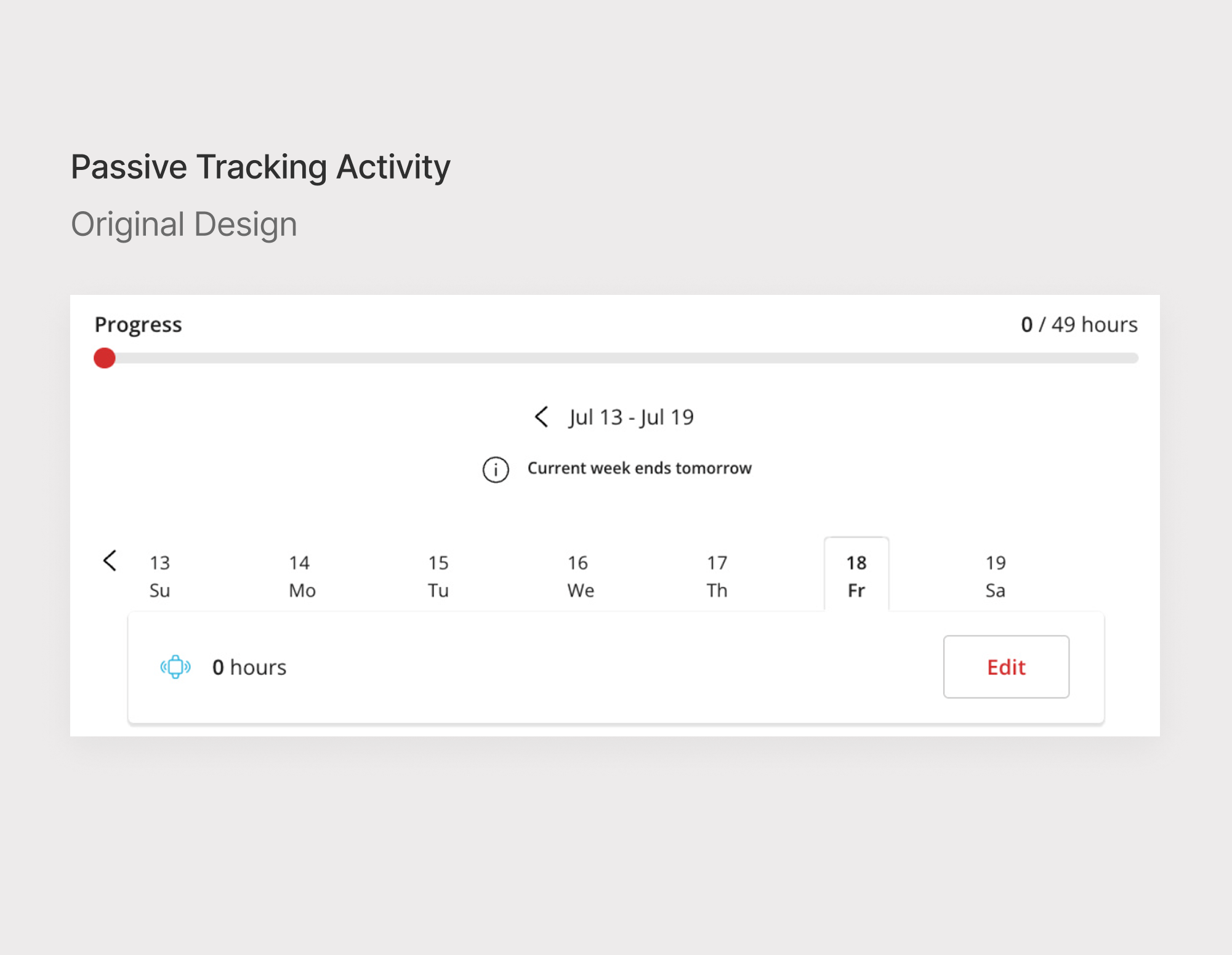
After
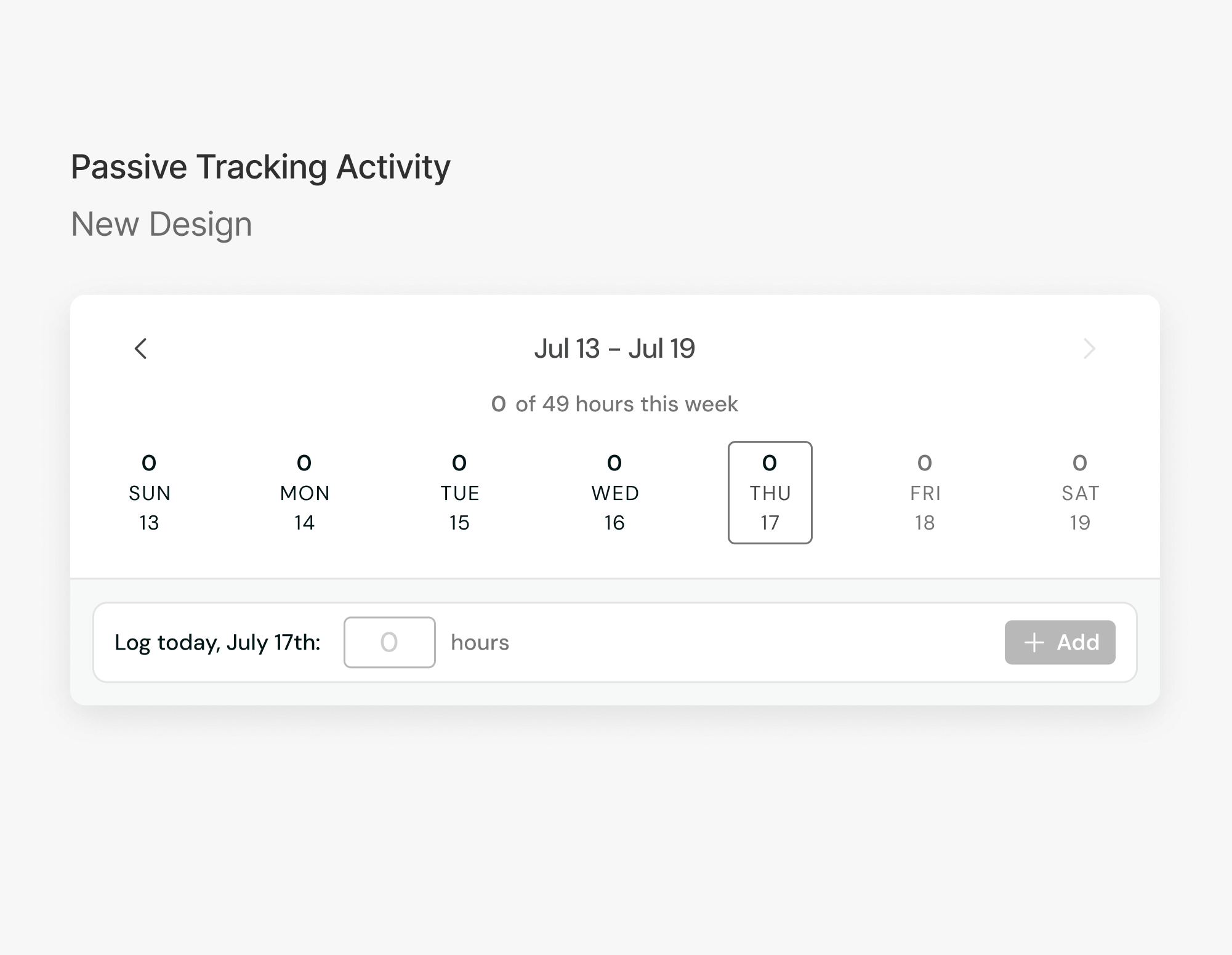
Progress tracking was consolidated into 3 defined patterns for passive, single-entry, and multi-entry activities. Here we see one variation, but each tracker follows the same structural framework while adapting its interaction and completion logic to the specific activity model.
SUB-CONTENT TILES
Before

After
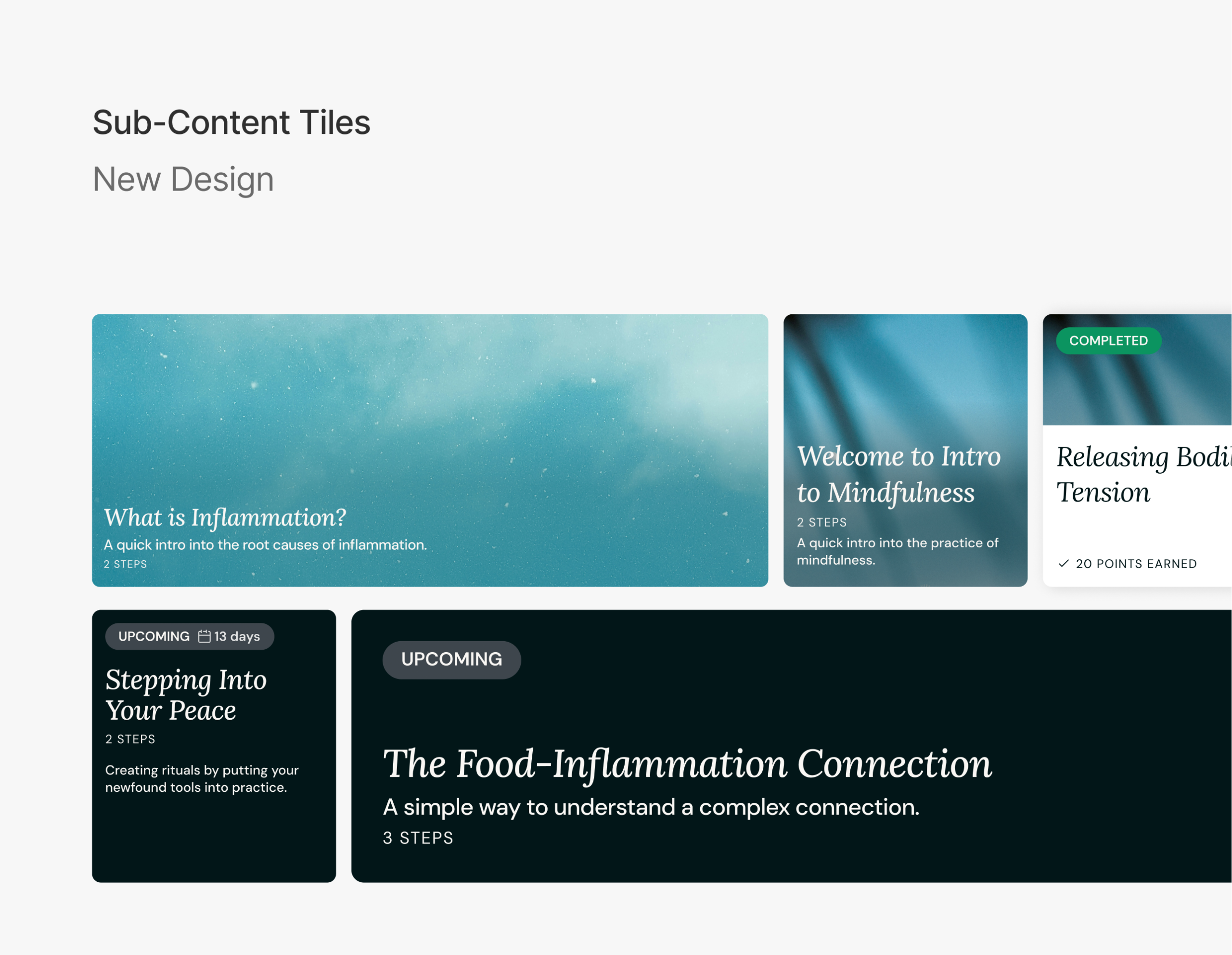
Transitioning away from squiggles required defining a clear sourcing framework. I worked with Content and Engineering to establish visual guardrails for tile imagery, prioritizing organic gradients, natural textures, and soft-focus abstraction tied to each content’s primary hero, ensuring flexibility without sacrificing cohesion or performance.
Designing Use Cases
MULTI-STEP VS. STANDALONE FORMATS
The system supports all content types, but the experience intentionally varies based on structure. Multi-step formats use stronger hierarchy and visual depth to signal progression, while standalone Activities remain simpler to reflect their one-off intent.
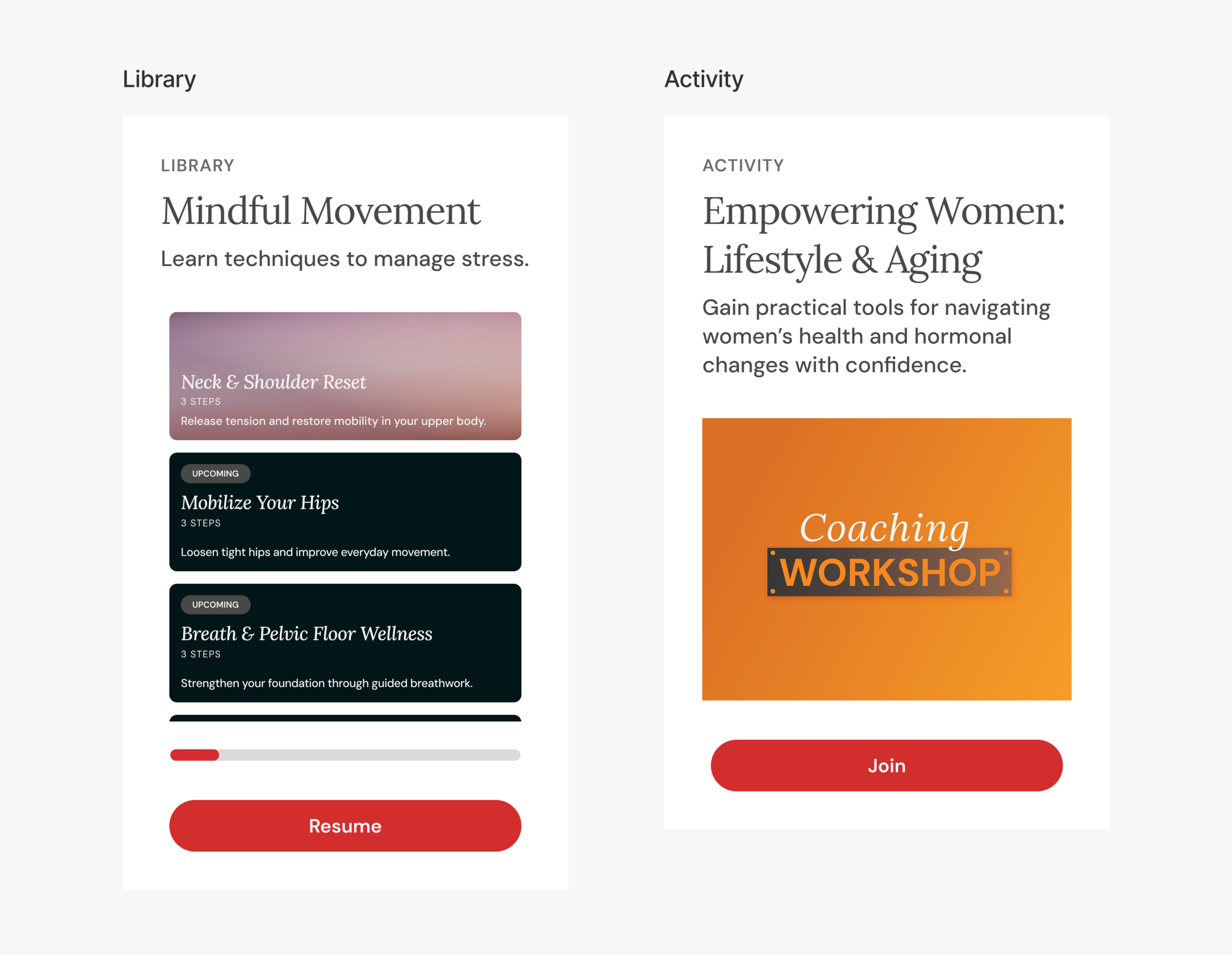
SHARED COMPONENTS, DYNAMIC BEHAVIOR
Enrollment and progress state play a significant role in how members understand and navigate content, especially within multi-step experiences like Paths, Series, and Libraries. Instead of creating separate layouts for each state, the design relies on shared components that adapt visually and behaviorally based on context.
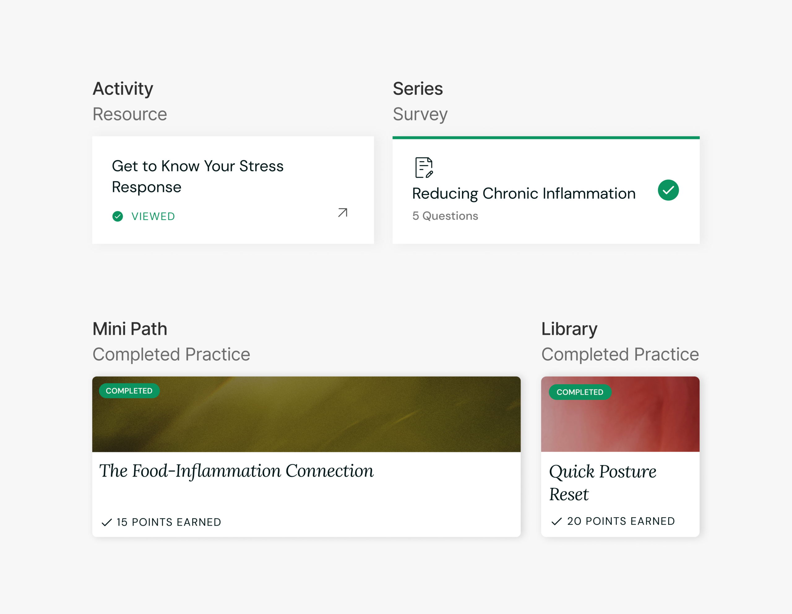
FILTERING FOR ACTIONABILITY
The progress status filter works in tandem with sub-content tiles to surface only the most relevant steps at a given moment, helping members focus on what’s actionable. This approach allows completed, in-progress, and upcoming content to live within the same structure, while still clearly communicating progress and next steps.
Dev Handoff
With all 39 variations accounted for within a shared framework, the focus shifted to preparing the work for a clean, low-risk handoff to engineering. Rather than handing off individual screens, the emphasis was on clearly defined components, states, and usage guidance, including visual guardrails for the gradient system so teams could build confidently without ongoing design interpretation.
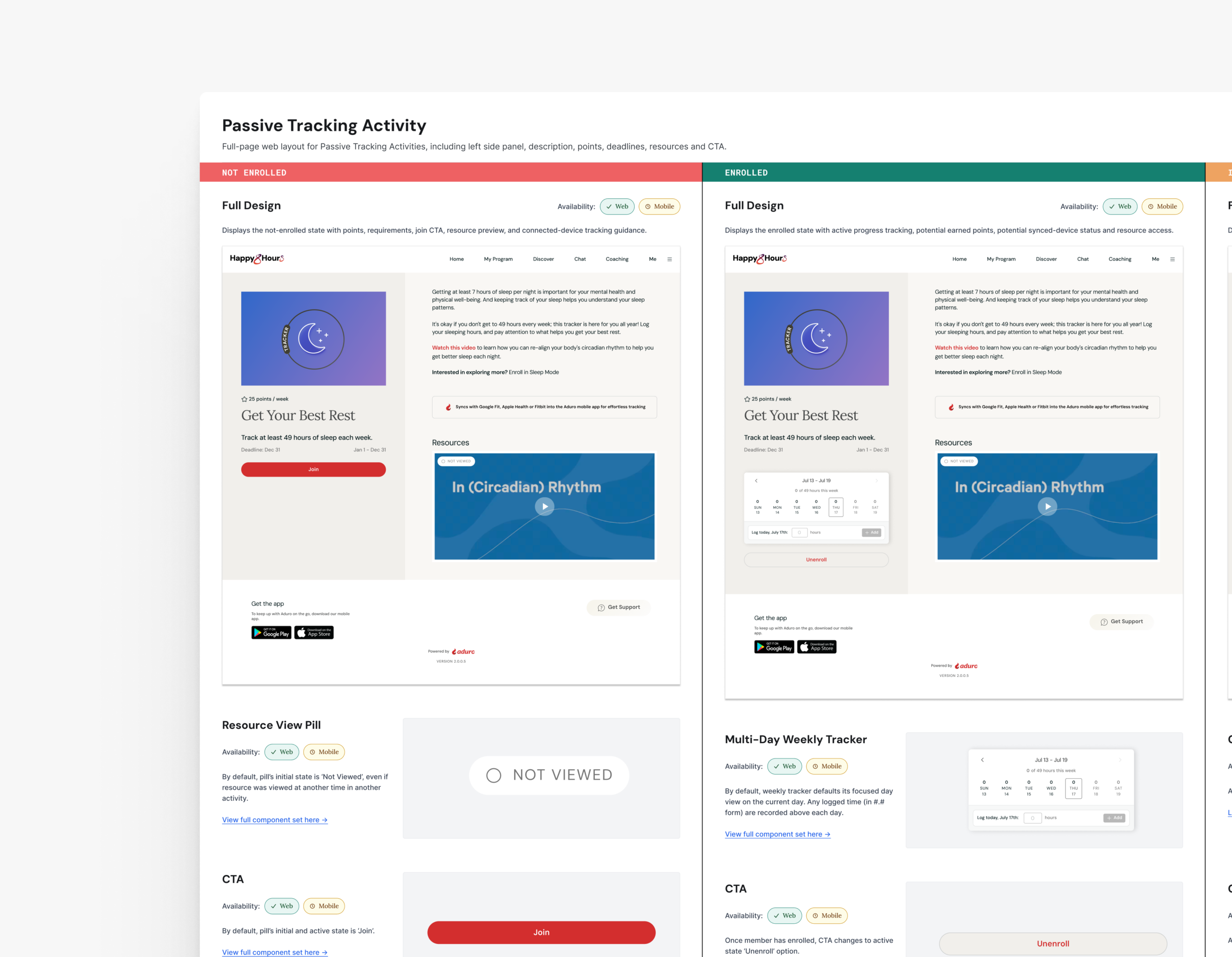
THE CHECKLIST
✔ Detailed specs
✔ Variant logic
✔ Edge cases
✔ Annotations
Impact & Outcome
Ahead of the EOQ1 launch, this work establishes a shared system for handling content across activity types and states. Consolidating dozens of variations into a single framework enables the experience to ship as one cohesive release while reducing ongoing design and engineering overhead.
For members, the redesigned pages feel more predictable and easier to navigate, with clearer signals around enrollment and progress, and a more cohesive visual language that reduces noise across dense content experiences.
Reflection
If I were to extend this work, I would continue refining how progress and completion states are surfaced across longer-running programs, especially as third-party content expands. As the content ecosystem grows, there is an opportunity to introduce more adaptive behaviors while keeping the underlying structure consistent and easy to maintain.
Let's connect!
Feel free to send me a message or schedule a call! I’m always open to sharing more about my work, showing additional projects, or talking through new opportunities.