Aduro Rebrand and Design System
A new scalable design system and brand to align with Aduro's evolving health-tech vision
DEVICE
Desktop + iOS/Android
INDUSTRY
Healthtech
SUMMARY
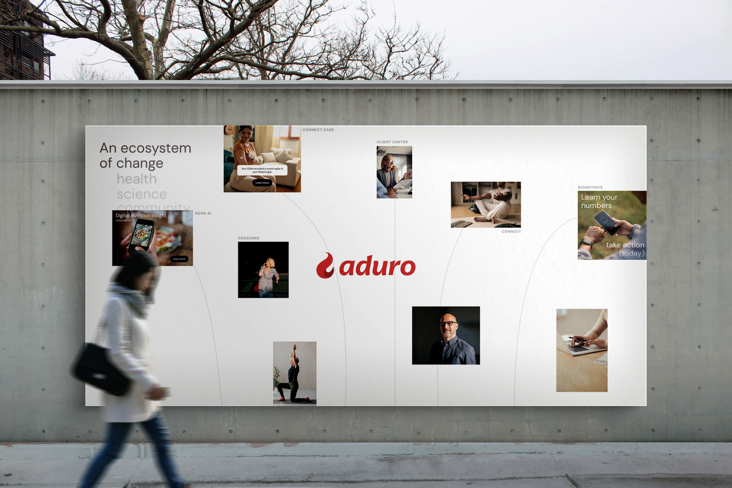
As Aduro evolved toward a more modern health-tech platform, its existing brand and UI foundations struggled to scale with new products and increasing complexity. I co-led the company's rebrand, partnering closely with a brand contractor while leading the design system and website redesign efforts. This work established a cohesive visual language, scalable UI foundations, and a clearer product direction that enabled future initiatives across the platform.
COMPANY
Aduro
DURATION / YEAR
Q2 2025
STATUS
Live
ROLE
Design System Lead & Rebrand Contributor
CONTRIBUTION
Design System · Brand Visual Direction · Website Redesign · Color Palette · Typography
PARTNERED WITH
Brand Team · CEO · CPO · Marketing · Content & Media Labs
TOOLS
Figma · Jira · Confluence · Illustrator · InDesign · Photoshop
BEFORE
AFTER
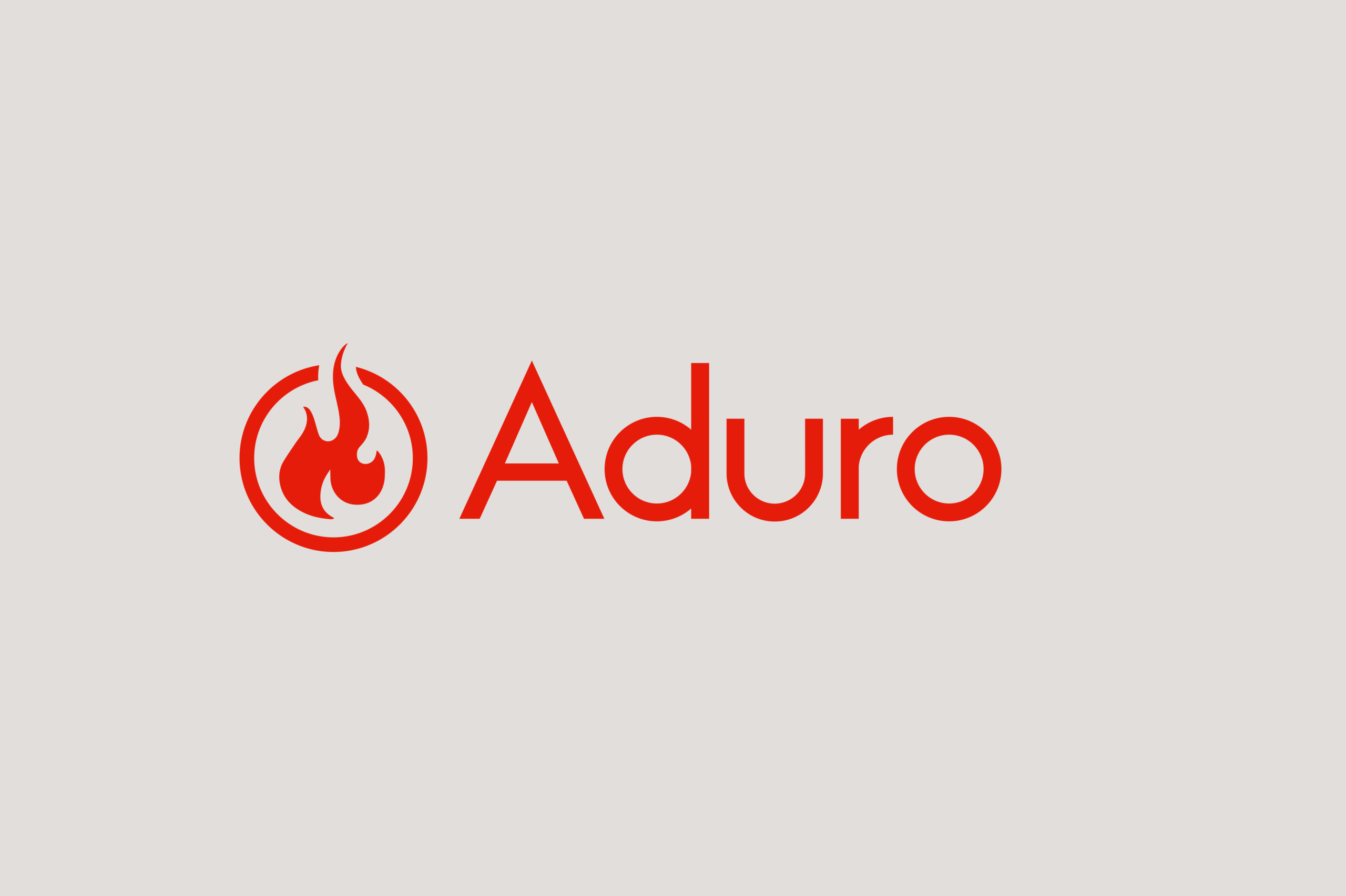

Credit: Justan Peterson ('After' logo); myself (graphics + visual design)
Context
Aduro is a B2B2C corporate wellbeing platform serving enterprise clients and their employees, offering programs across physical health, mental wellbeing, and lifestyle behavior change. As the platform expanded to support more complex data, personalization, and AI-driven features, its existing brand and UI foundations struggled to scale cohesively across product and marketing surfaces. This project took place during a broader shift toward positioning Aduro as a modern health-tech platform rather than a traditional wellbeing vendor.
Initial Constraints
This rebrand was constrained by a short-term contract with an external brand lead, which meant moving quickly and aligning on direction early. After the contract ended, I carried the work forward by leading the design system and website efforts, ensuring continuity with the brand vision that had been established. The challenge was balancing speed with decisions that would scale long term.
Challenge
As Aduro expanded its product offerings and technical capabilities, the lack of a unified brand and design system began to create friction across teams. UI patterns were inconsistently applied, design decisions were repeatedly revisited, and the website failed to represent the platform’s direction as a modern health-tech product. Addressing these gaps required more than surface-level updates – it demanded a foundational reset.

Goals and Success Criteria
- Create a cohesive foundation that brings product, brand, and marketing surfaces into a single design language
- Turn the new brand direction into scalable systems that supports consistent UI decisions across teams
- Reduce fragmentation and rework by setting clear standards for typography, color, components, and layout
- Maintain momentum after the rebrand phase by carrying brand intent forward through the design system and website, without ongoing reliance on brand leadership
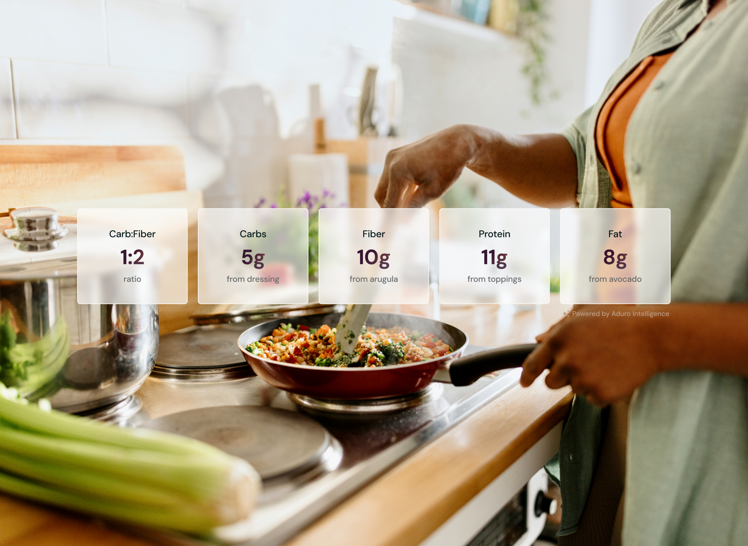
- Visually position the platform to reflect its shift toward a modern health-tech and human performance product
Translating Brand to Product
UNIFIED, NOT UNIFORM
The brand emphasized a unified voice across visuals and messaging, but product experiences required flexibility to support diverse programs and use cases. Rather than enforcing rigid layouts, the design system focused on shared foundations (typography, color, spacing, and components), allowing teams to adapt patterns without fragmenting the experience. This ensured cohesion without limiting product evolution.

CLARITY THROUGH REDUCTION
A key goal of the rebrand was to simplify an experience that had grown overly complex. In our suite of products across the BoB, that meant cleaner layouts, clearer hierarchy, and more intentional use of color. Reducing visual noise helped the interface feel more focused and better aligned with Aduro’s position as a confident, modern health-tech platform.

SCALABLE BY DEFAULT
The brand was designed to grow and the product system needed to do the same. Components, tokens, and patterns were built with extensibility in mind, ensuring new features and programs could be introduced without rethinking foundational decisions. This principle guided system architecture so future work could move faster without sacrificing consistency.
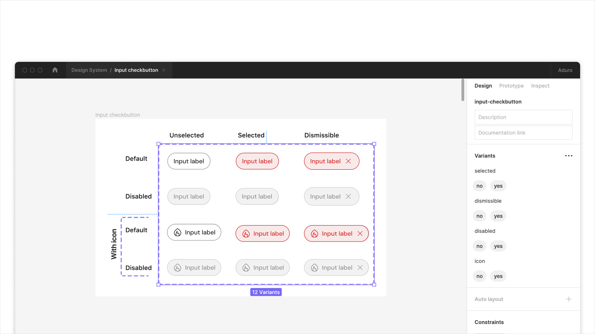
HUMAN, NOT CLINICAL
Aduro’s brand positions human performance at the center of its mission, balancing sophistication with warmth. This meant pairing clean, modern UI foundations with approachable typography, thoughtful spacing, and human-centered visual moments. The goal was to feel credible and modern without drifting into cold or overly clinical design.
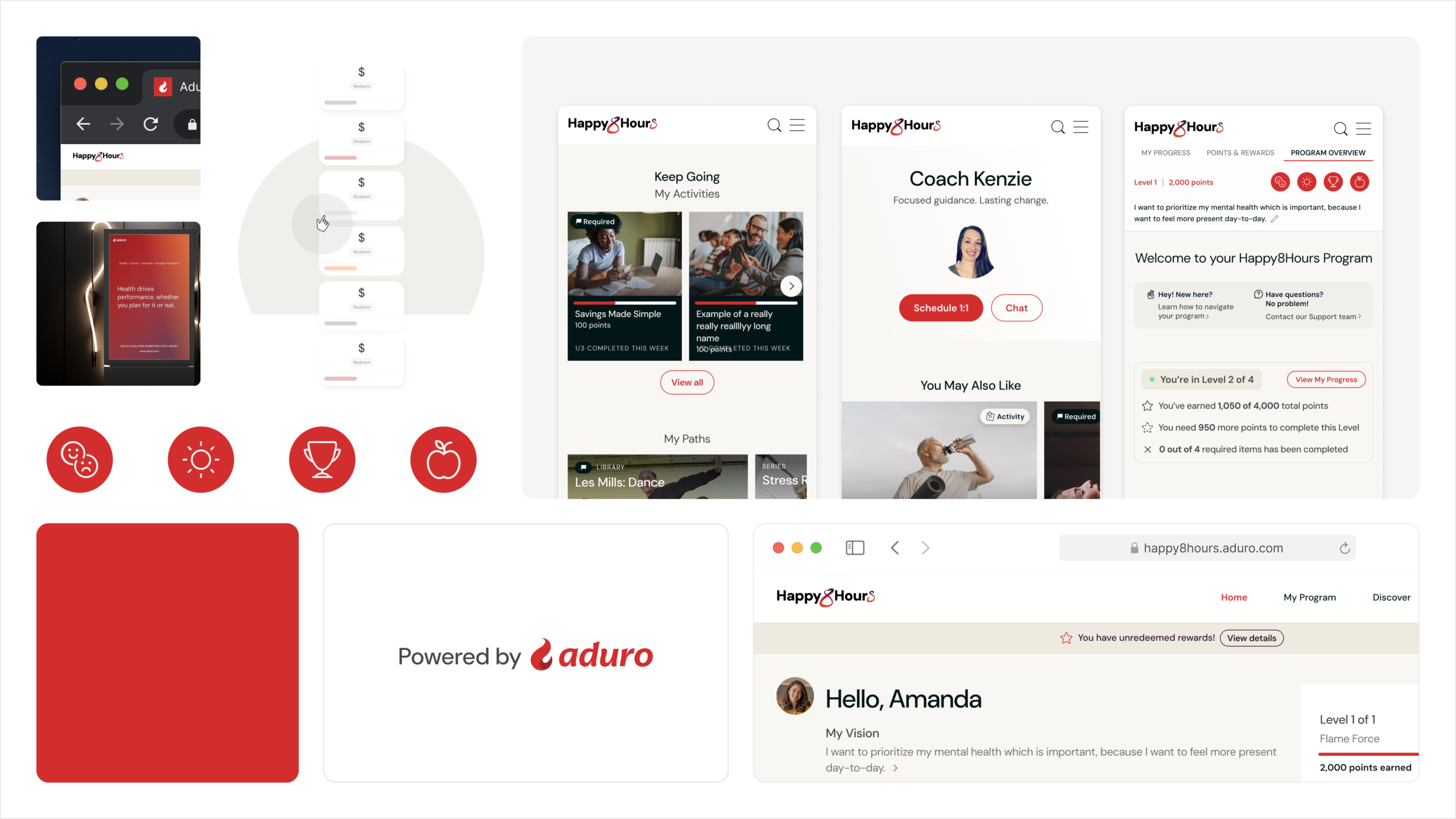
FROM BRAND VISION TO PRODUCT REALITY
While the brand guidelines set the visual direction, the design system turned that direction into decisions teams could use every day. This ensured the rebrand extended beyond marketing and became part of the product itself.

Design System Foundations
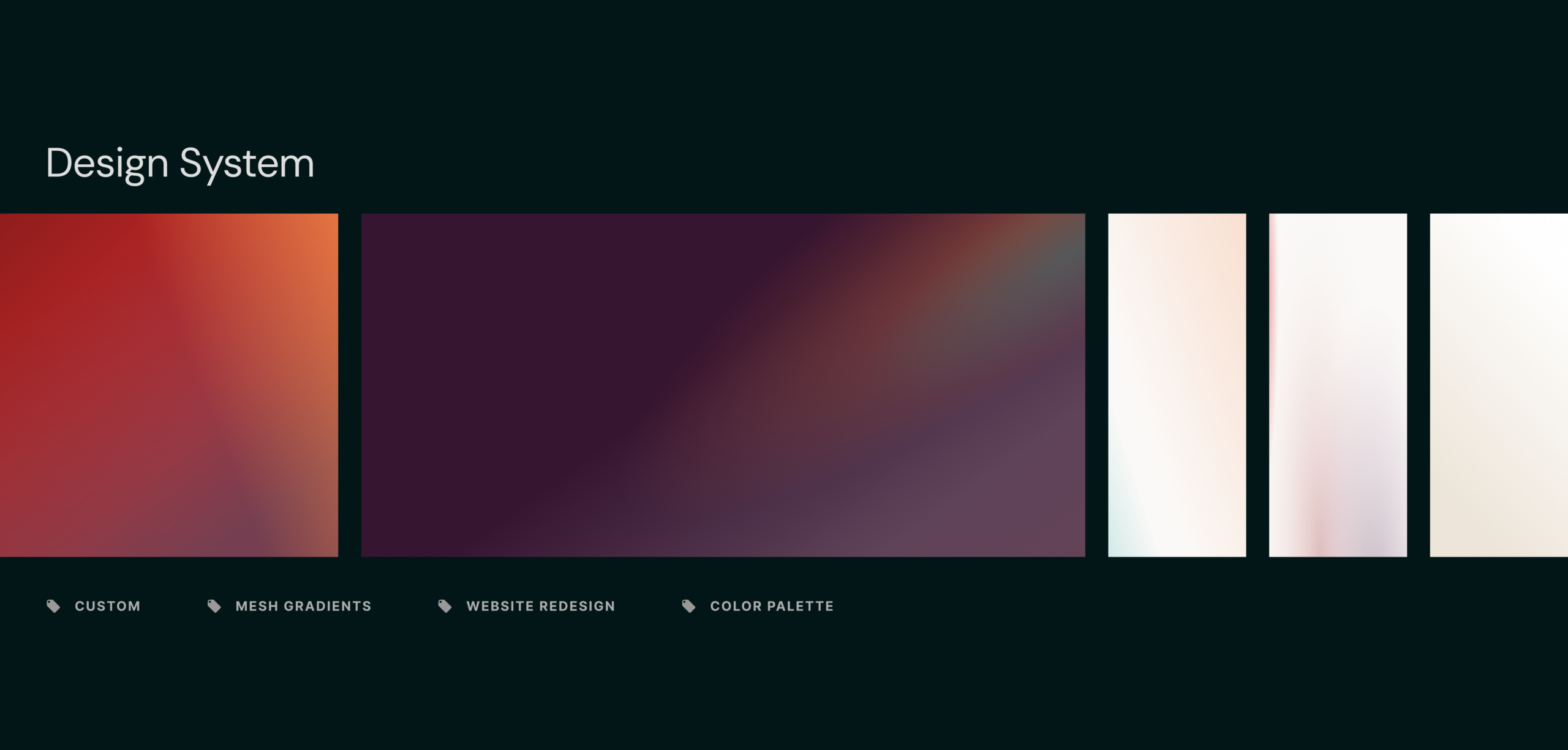
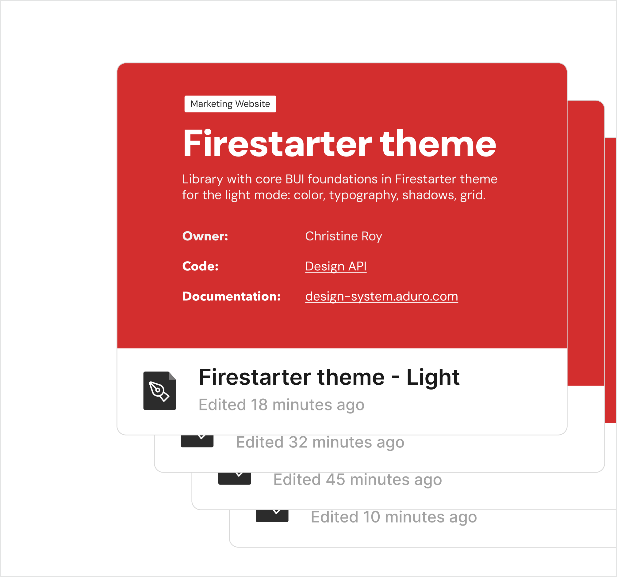
To carry the rebrand forward beyond initial exploration, I led the creation of a scalable design system that translated brand intent into product-ready foundations and served as a single source of truth for product teams.
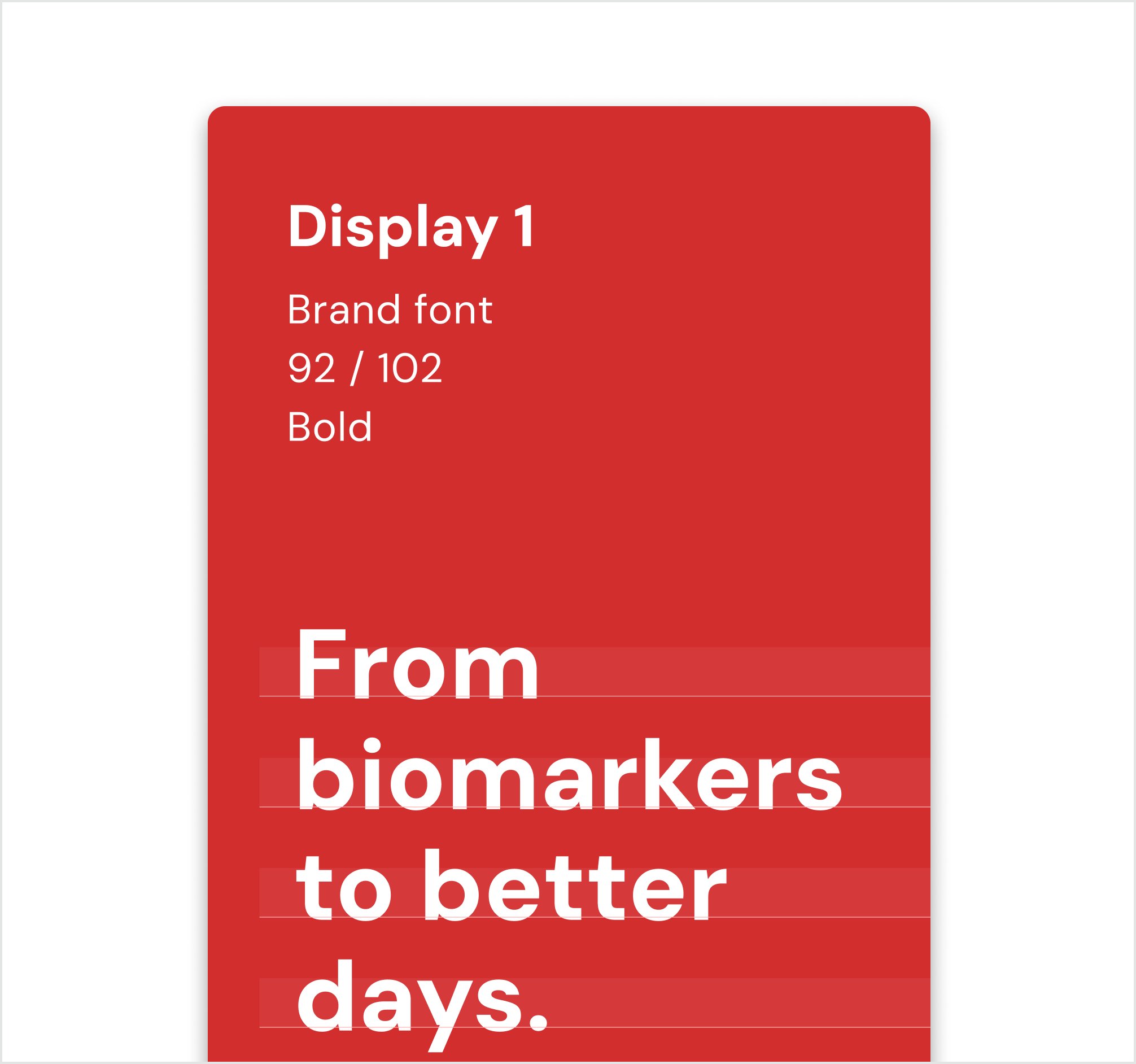
FOUNDATIONAL ELEMENTS
Core foundations (typography, color, spacing, and layout) were defined to reinforce hierarchy, accessibility, and consistency across product surfaces.
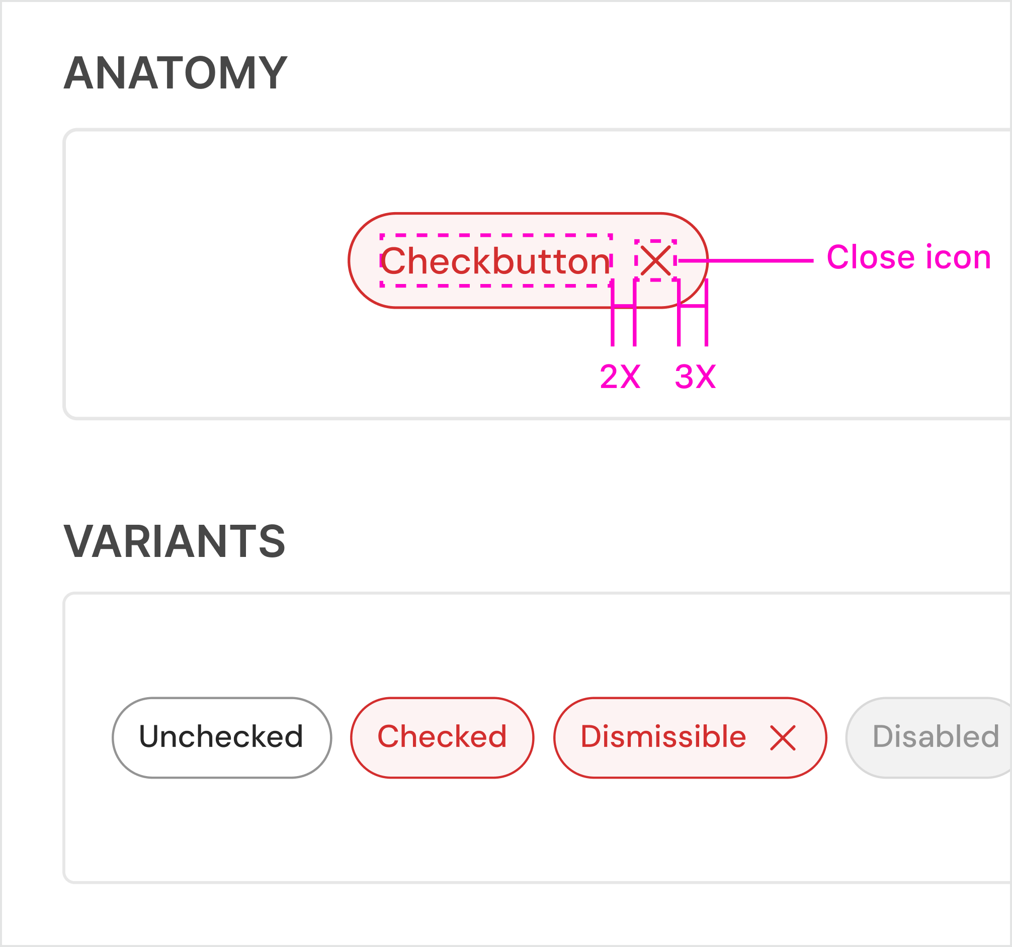
COMPONENT ARCHITECTURE
Reusable components were designed with clear variants, constraints, and usage guidance to reduce ambiguity for efficient engineering handoff.
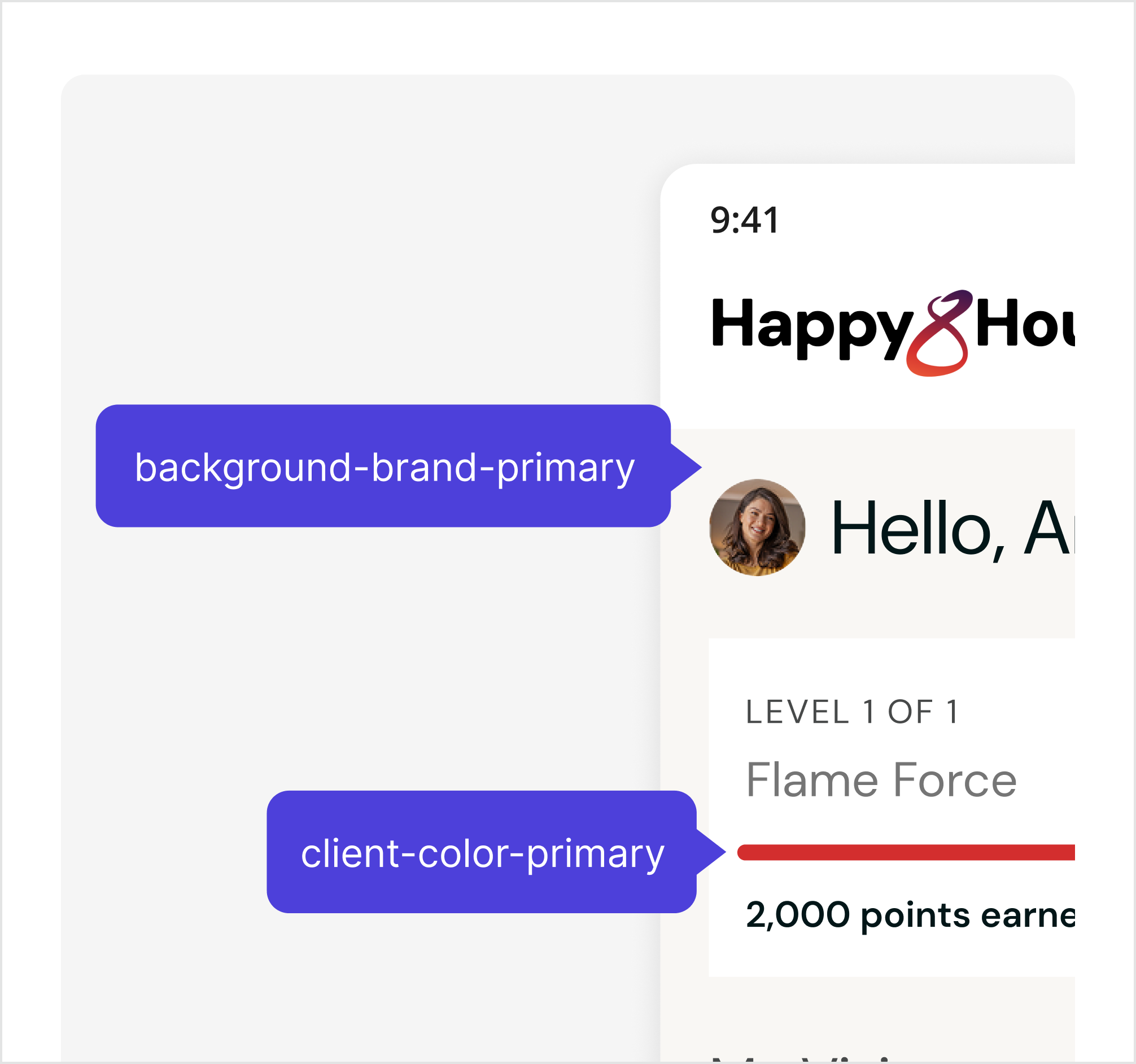
DESIGN TOKENS & SYSTEMIZATION
Key visual decisions were systemized through tokens to ensure platform consistency and enable easier iteration as the product evolved.
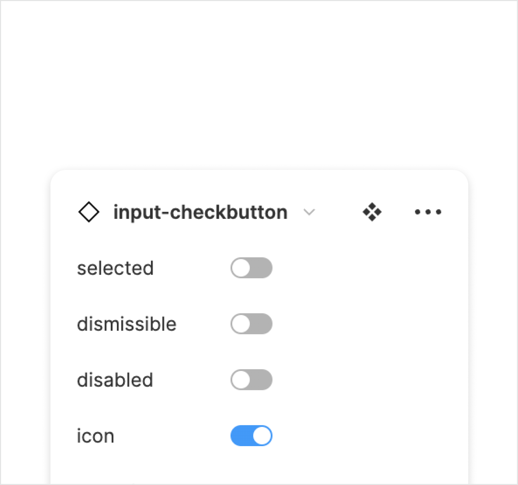
BRIDGING BRAND & PRODUCT
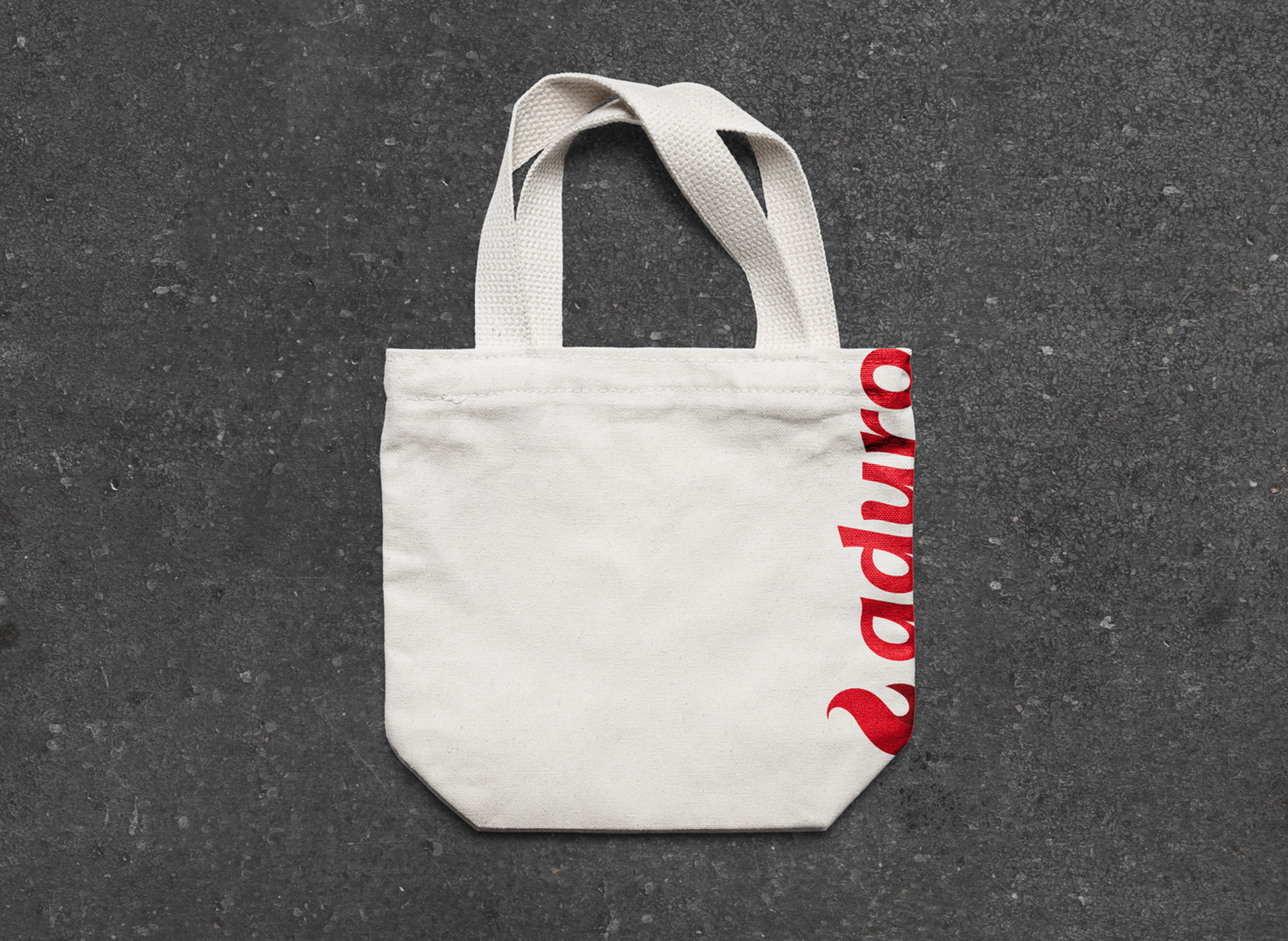
The design system operationalized the brand guidelines by translating visual direction into practical, repeatable patterns teams could apply day to day.
Website Redesign
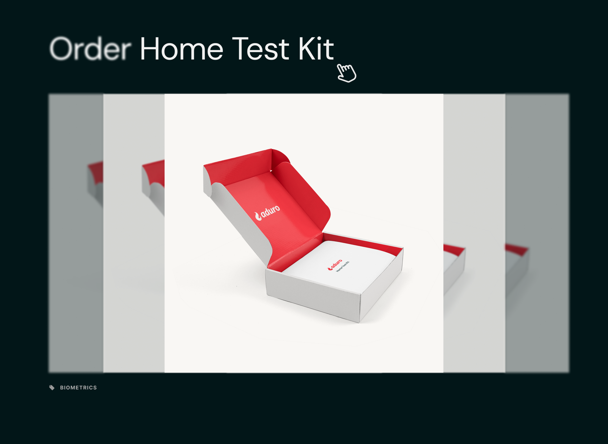
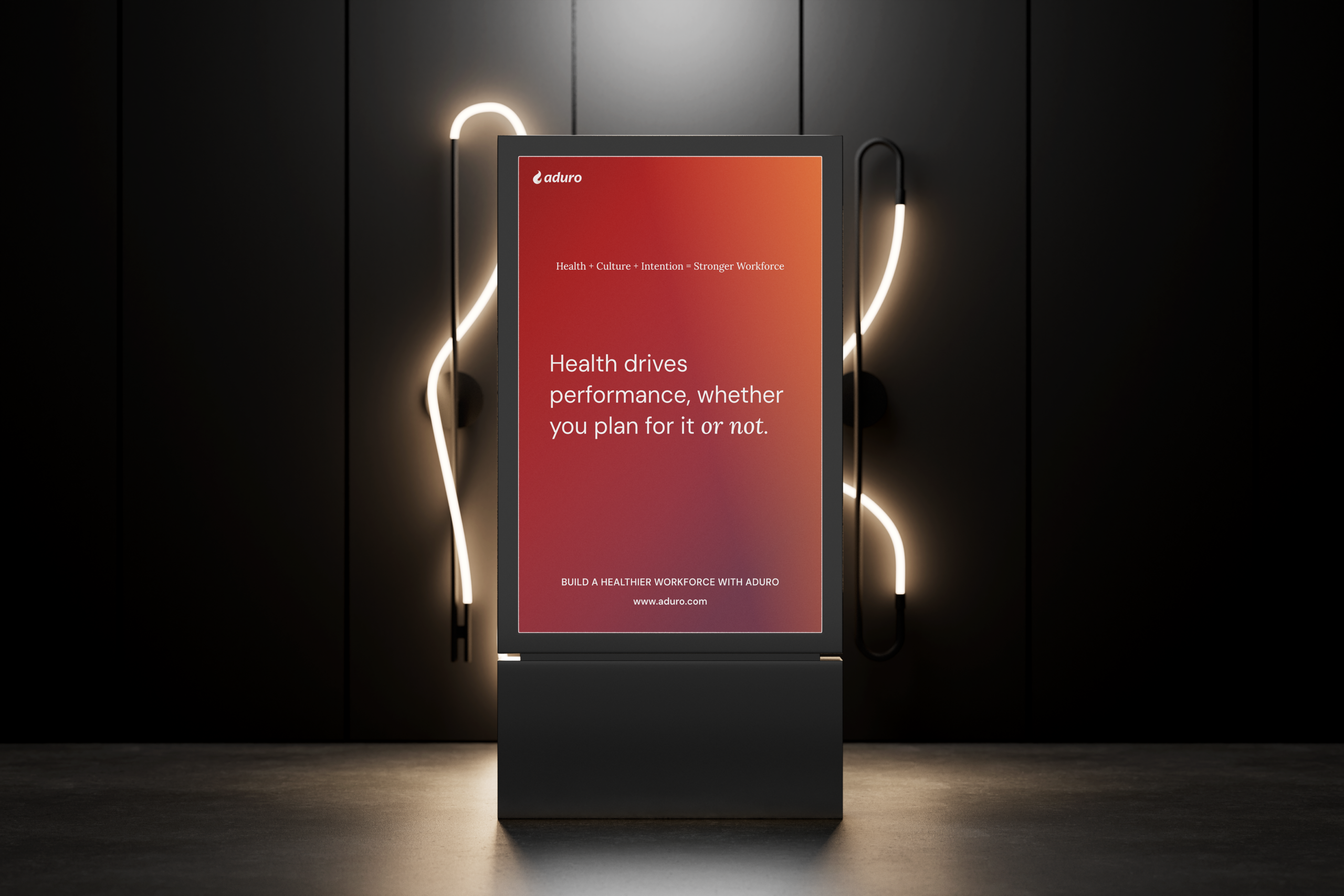
I led the website redesign as the first major application of the new brand and design system, turning foundational decisions into a real, customer-facing experience.
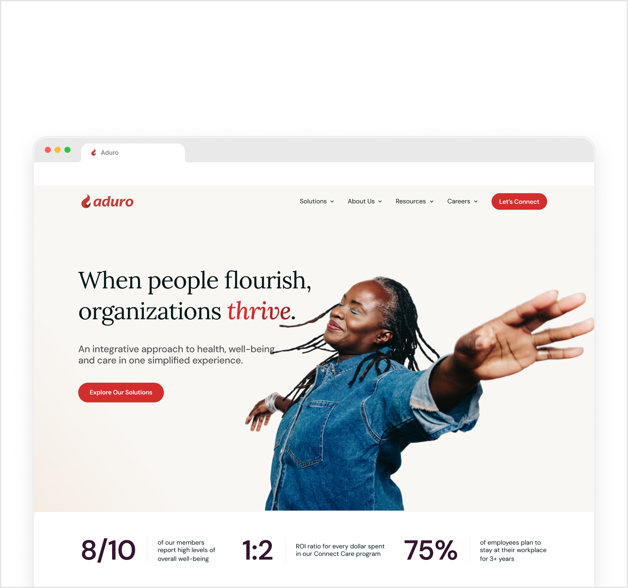
APPLYING THE NEW BRAND LANGUAGE
Brand typography, color, and layout standards were applied consistently to create clearer hierarchy and a more confident visual presence.
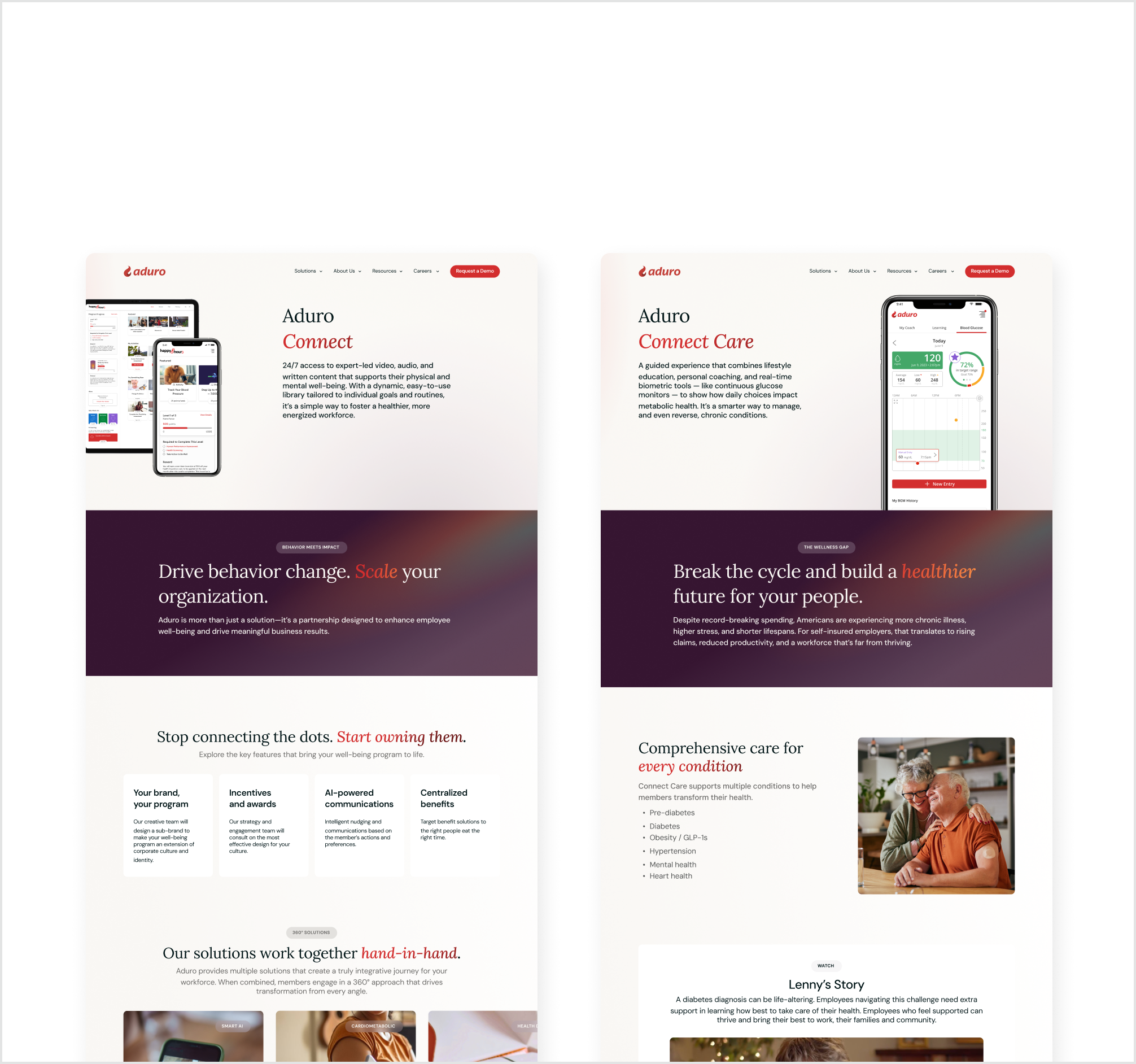
SYSTEM-DRIVEN LAYOUTS
Pages were built from reusable layout patterns to avoid one-off designs and maintain consistency at scale.
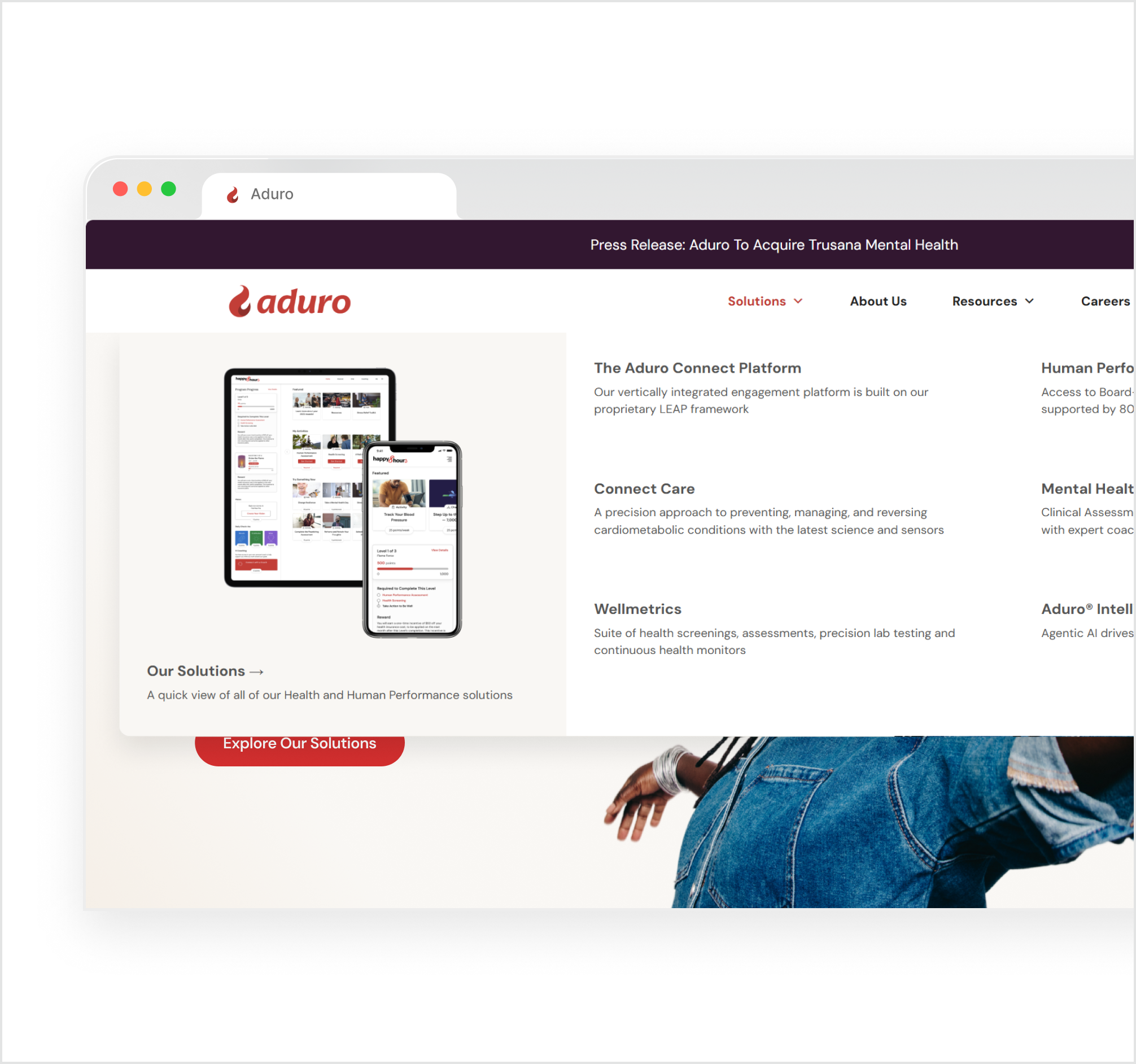
CLARITY FOR MULTIPLE AUDIENCES
Navigation and content hierarchy were simplified to clearly serve enterprise buyers, partners, and members.
DESIGNING FOR SCALE
Grounding the website in system foundations enabled faster iteration and easier future expansion.



Impact and Outcome
ESTABLISHED VISUAL FOUNDATION
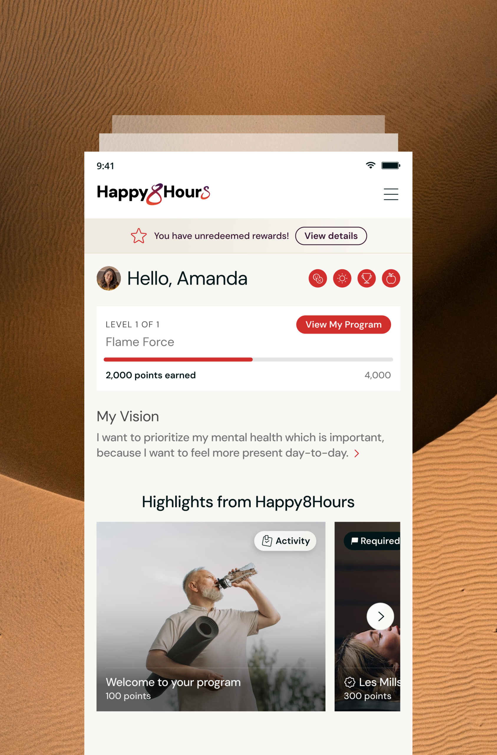
Aligned product, brand, and marketing surfaces under a single, cohesive design language.
REDUCED TEAM FRICTION
Improved clarity during handoff and implementation by introducing shared standards and reusable components.
FASTER ITERATION & SCALABILITY
Both product and website work became grounded in a system-driven approach rather than one-off designs.
IMPROVED INTERNAL ALIGNMENT
Teams were now able to adopt a consistent source of truth for visual and UI decisions.


Next Steps
This project reinforced the importance of translating brand vision into systems teams can actually use and sustain. With a lengthier timeline, I’d further expand system documentation and adoption support to help teams move even faster with less ambiguity. As the platform evolves, we will continue evolving the system alongside new product capabilities to ensure the brand remains cohesive as the platform grows.
Let's connect!
Feel free to send me a message or schedule a call! I’m always open to sharing more about my work, showing additional projects, or talking through new opportunities.