Connect Home Page
Overhauling the member entry point to drive clarity, engagement, and scalable UI modernization
DEVICE
Desktop + iOS/Android
INDUSTRY
Healthtech
AUDIENCE
Organizational employees
SUMMARY
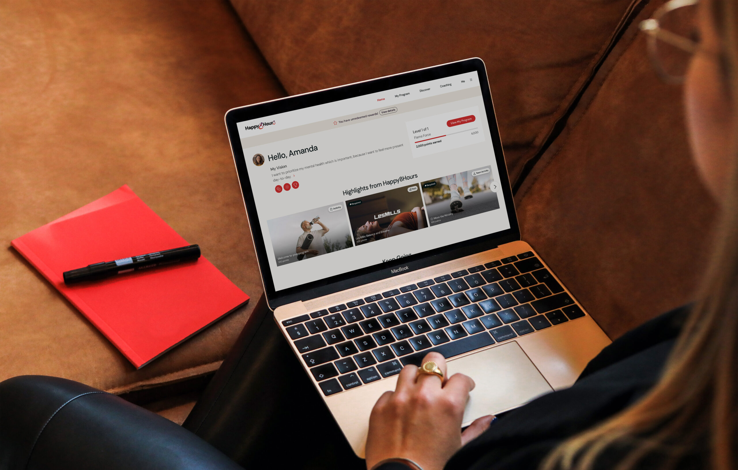
Connect is a health-tech ecosystem of guidance, tools, and features that leverages machine learning -- and more recently, AI -- to power personalized well-being experiences for members. Over time, the Home page became increasingly convoluted, making it difficult for users to understand what mattered most or how to engage meaningfully.
I led the redesign of the member experience starting with Home, establishing a clear design vision, aligning stakeholders around a shared roadmap, and partnering closely with Product to deliver within active client PGs. This work not only improved usability and engagement, but also laid the groundwork for Nova AI and future cross-product consistency across Aduro’s web and mobile platforms.
COMPANY
Aduro
DURATION / YEAR
Q3, Q4 2025 (Multi-phase rollout)
STATUS
Shipped
ROLE
Lead Product Designer
CONTRIBUTION
End-to-end UX/UI · Research · Testing · Prototyping
PARTNERED WITH
PM · CPO · Engineering · Content Strategy
TOOLS
Figma · Mixpanel · Miro · FigJam · Usertesting.com · ProtoPie
Platform Context
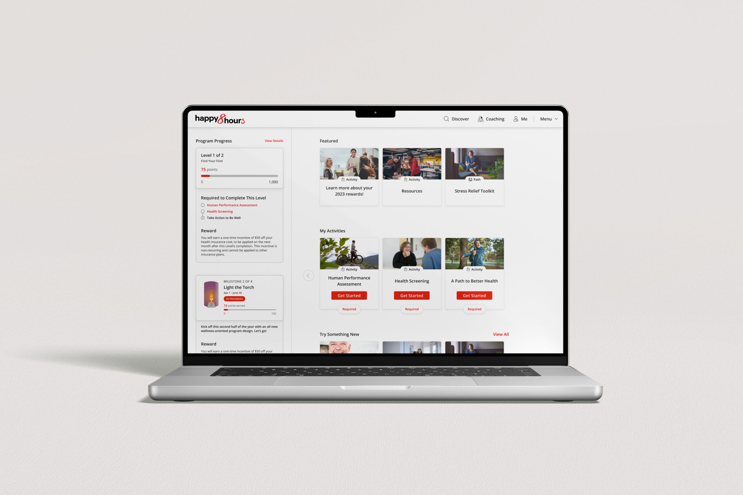
Aduro is a healthtech company providing enterprise well-being solutions for organizations through its Human Performance platform, Connect. Connect serves as the member-facing experience for employees participating in employer-sponsored health and wellness programs, integrating biomarker data, personalized goals, and program content. The Home page is the most frequently accessed surface in the platform, acting as the primary entry point where members access health and well-being content tailored to their health data and chronic conditions.
Initial Constraints
We faced an incredibly tight deadline to launch the new designs before our client PG, ensuring it would be ready in time for renewal season, only 4.5 months out.
Challenge
For a long time, the Home page was designed to support a growing set of features and programs, without a single unifying strategy for how members should engage day to day. Clients were able to add new content, requirements, and calls to action as long as they aligned to their employees' program goals. And over time, with multiple client requests for ad-hoc structure requests, the page became convoluted, making it difficult to deliver meaningful personalization or clearly guide members toward the actions that mattered most for their health, or for the business.
This approach also required our Product team to build one-off solutions, negotiate placement across limited Home real estate, and define success metrics independently for each release, slowing iteration and making it harder to evaluate impact holistically across the platform.
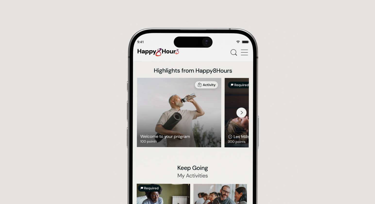
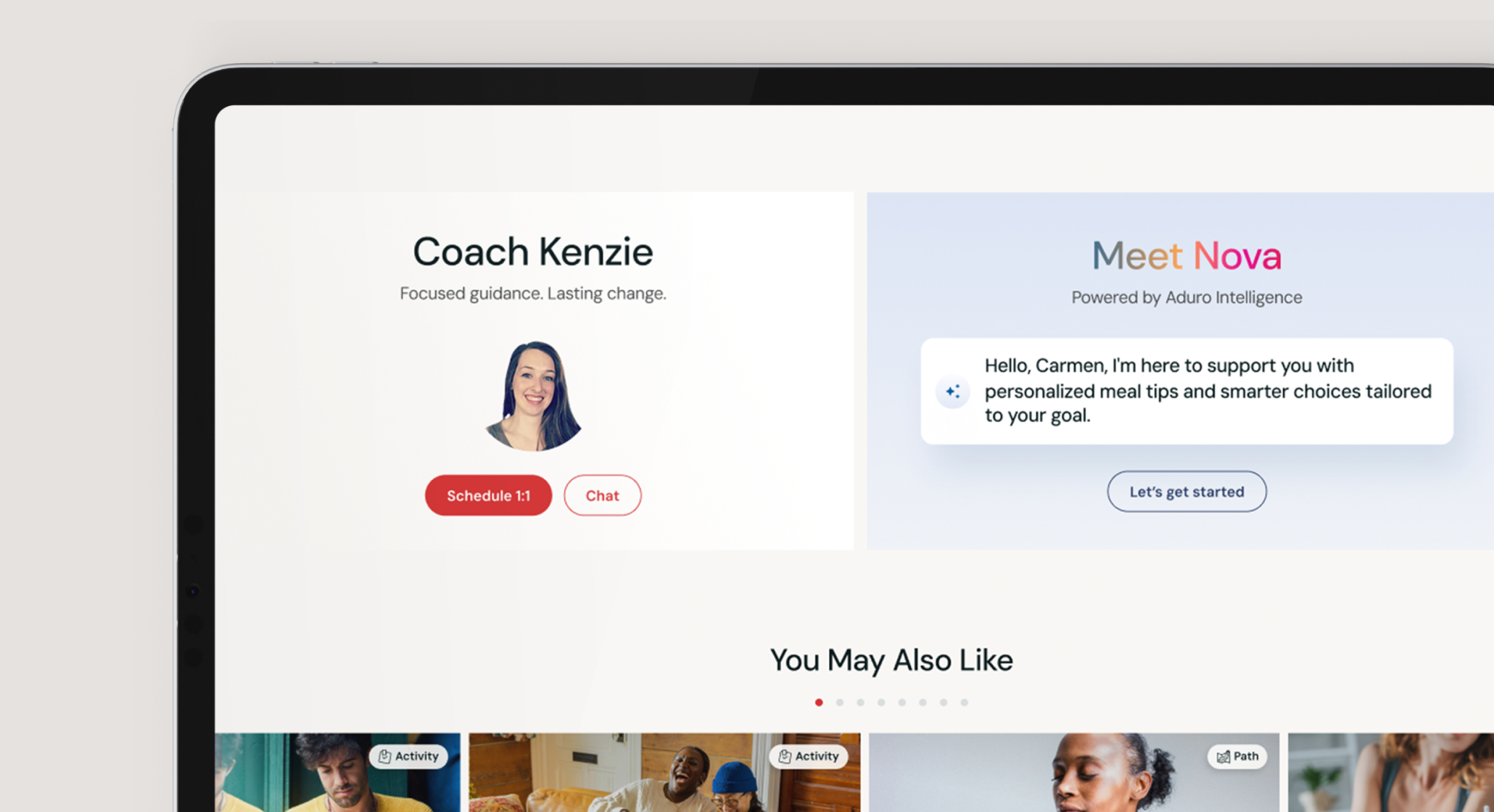
My final designs for Connect Home page

The original design was 10+ years old and didn't incorporate the updated Aduro brand. There was also a lack of consistency in the designs across all of our platforms: Connect Care, Client Center and Support Center, resulting in a significant amount of effort required for support.
Design Vision and Goals
In collaboration with the CPO, data team, and product counterparts, I came up with a design vision that demonstrated the opportunity of moving to a multi-purpose and multi-product universe, taking into consideration the ambitious roadmap ahead of Aduro with the new rebrand. In order to achieve this, I realized that we would need to build an ecosystem powered by Machine Learning while still feeling like a familiar experience with a low learning curve.
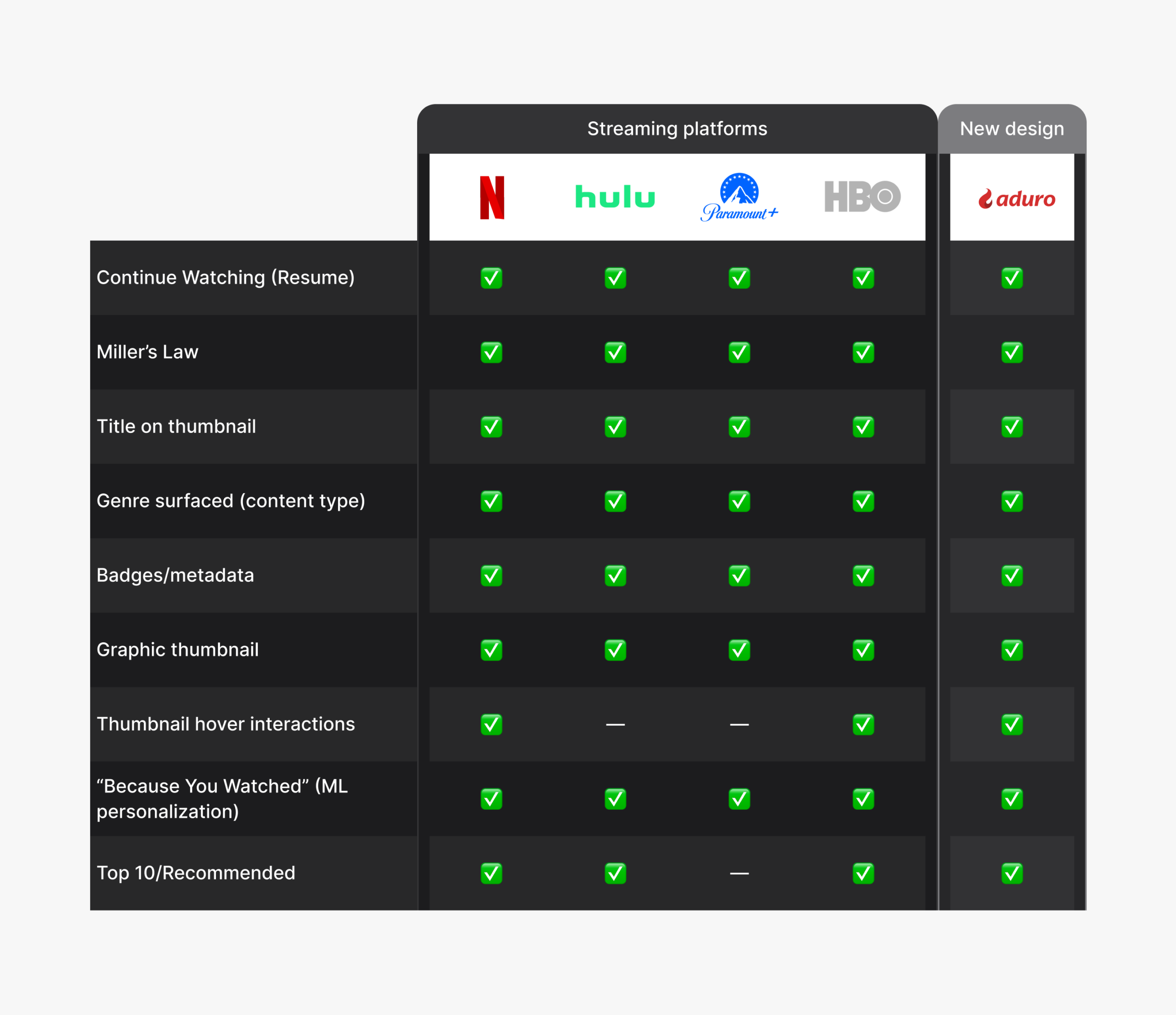
Based on our research, we discovered that, similar to streaming platforms, the Home page primarily focused on providing a lot of content options at once. As a result, I primarily examined the structure and frameworks of streaming TV apps that our members were already familiar with to better understand their preferences and expectations around navigation.
Research and Strategy
INTERVIEWS
Through member interviews, support call analysis, and Mixpanel behavioral data, I identified four core insights:
- Members wanted clarity and direction: “What do I need to do today?”
- Daily habit tracking was valued but not surfaced prominently
- Content felt overwhelming without context or personalization
- Members wanted to see their progress and feel rewarded for consistency
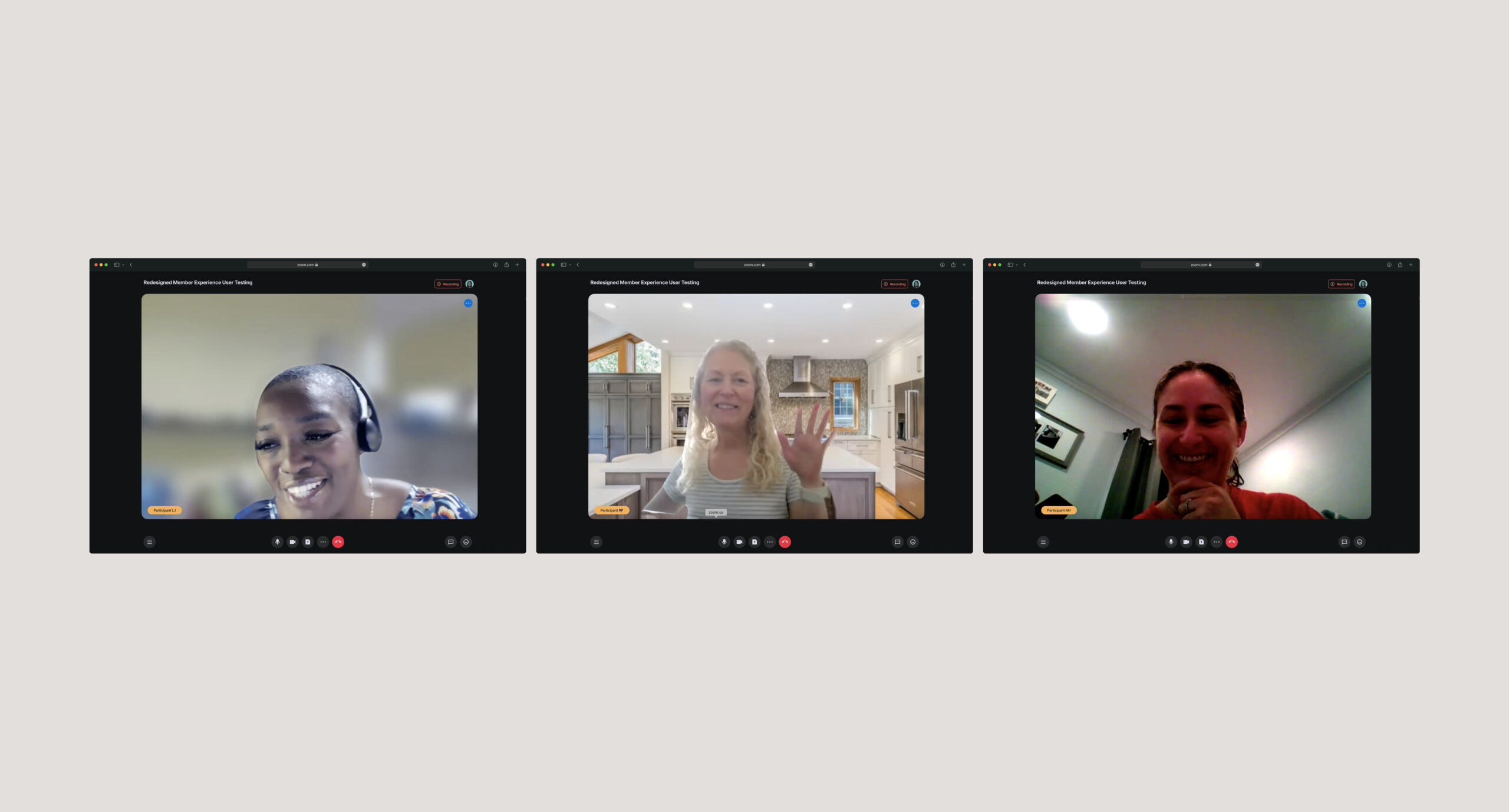
A few awesome testing participants :)
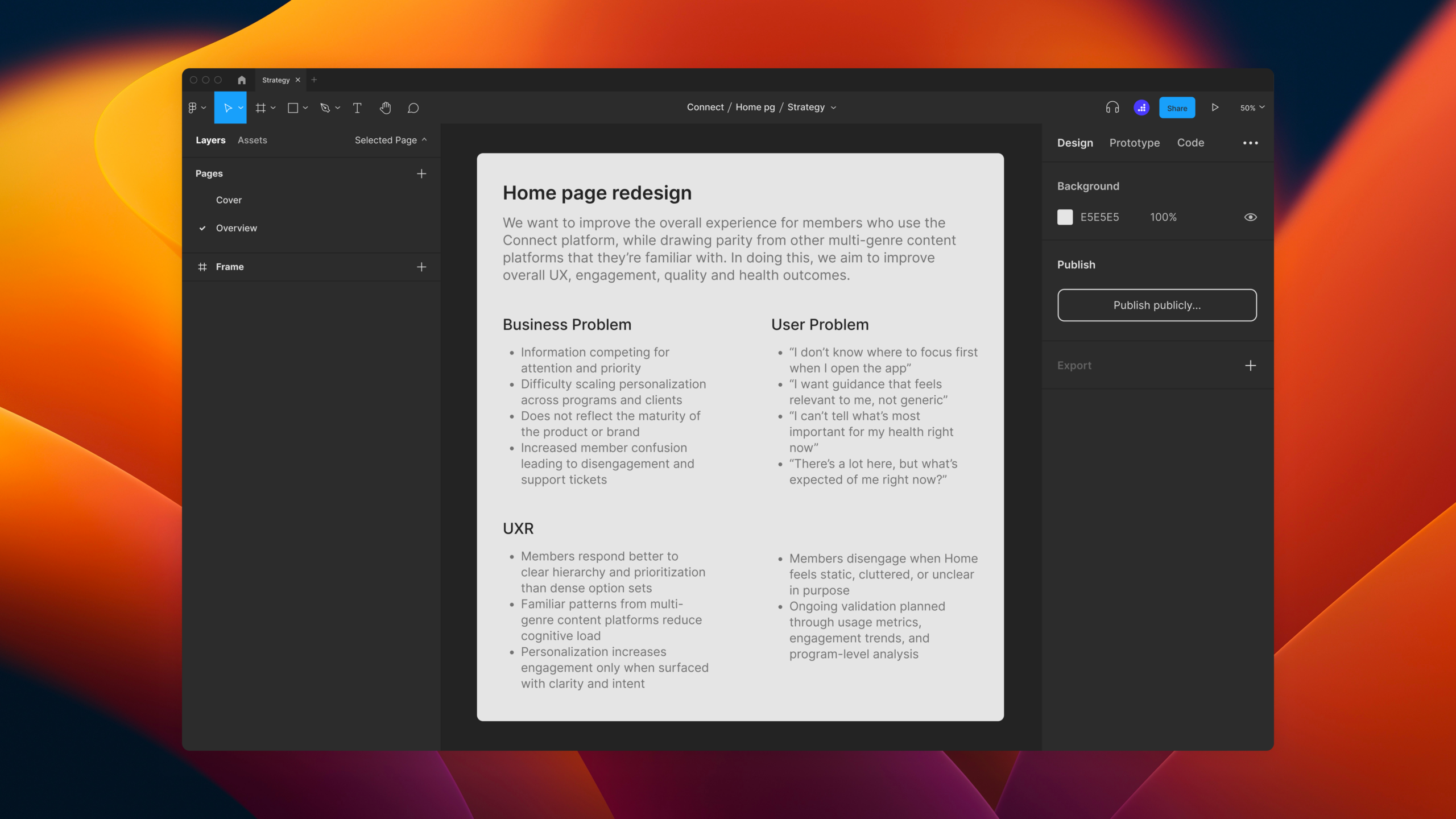
A quick glimpse into our strategy doc
Research Synthesis
18 MEMBER INTERVIEWS
28 EXTERNAL USER PROTOTYPE CLICKTHROUGHS
Members validated my initial design direction, confirming that the Home page wasn't a content problem, it was an intent problem.
LIGHTWEIGHT DISCOVERY
Members demonstrated quick engagement in the new UI which suggested, but didn't overwhelm with content.
MOTIVATION
Members enjoyed the quick access to their in-progress content, similar to streaming services that led with 'Continue Watching...'
CONTINUITY
Members were relieved to be able to pick up where they last left off with such ease in the new design.
Competitor Analysis + Feature Prioritization
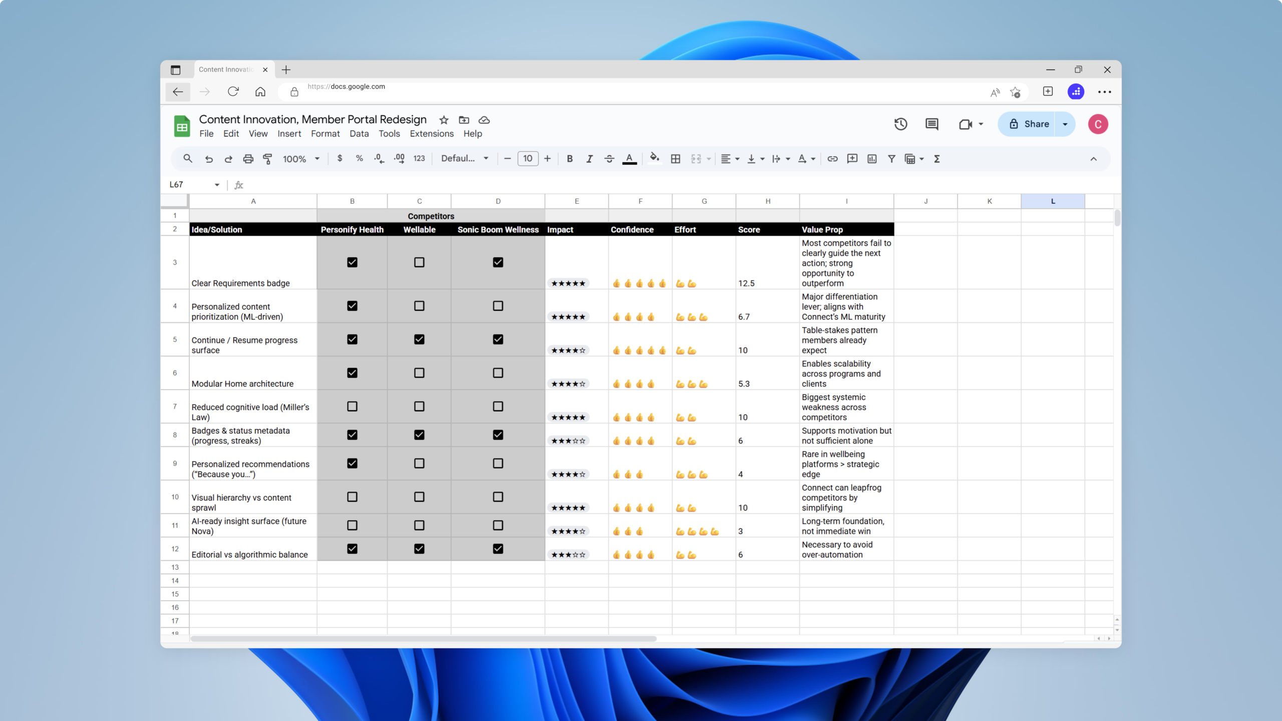
We collected various problems from internal research, member interviews, customer support feedback, app store reviews, and business needs. Then we brainstormed and used the ICE Prioritization framework with a competitor analysis exercise to come up with solutions.

Success Metrics
- +15% increase in weekly active users (WAU) within the first 8 weeks of rollout
- +15% increase in “resume activity” actions from the Home page
- +20% increase daily active engagement with daily trackers
Constraints and Tradeoffs
This project required navigating several constraints which shaped the IA, component structure, and prioritization of features:
FEATURE-FLAGGED ROLLOUT
We needed a design that could gracefully adapt for members not yet in the Nova AI cohort.
ENGINEERING BANDWIDTH
We prioritized components that could be built incrementally and reused across the product.
CLINICAL SAFETY
All recommendations needed to align with clinical guidelines and avoid overstepping therapeutic boundaries.
CONTENT LIMITATIONS
The content library was mid-migration, so the design had to support inconsistent metadata.
Designing Use Cases
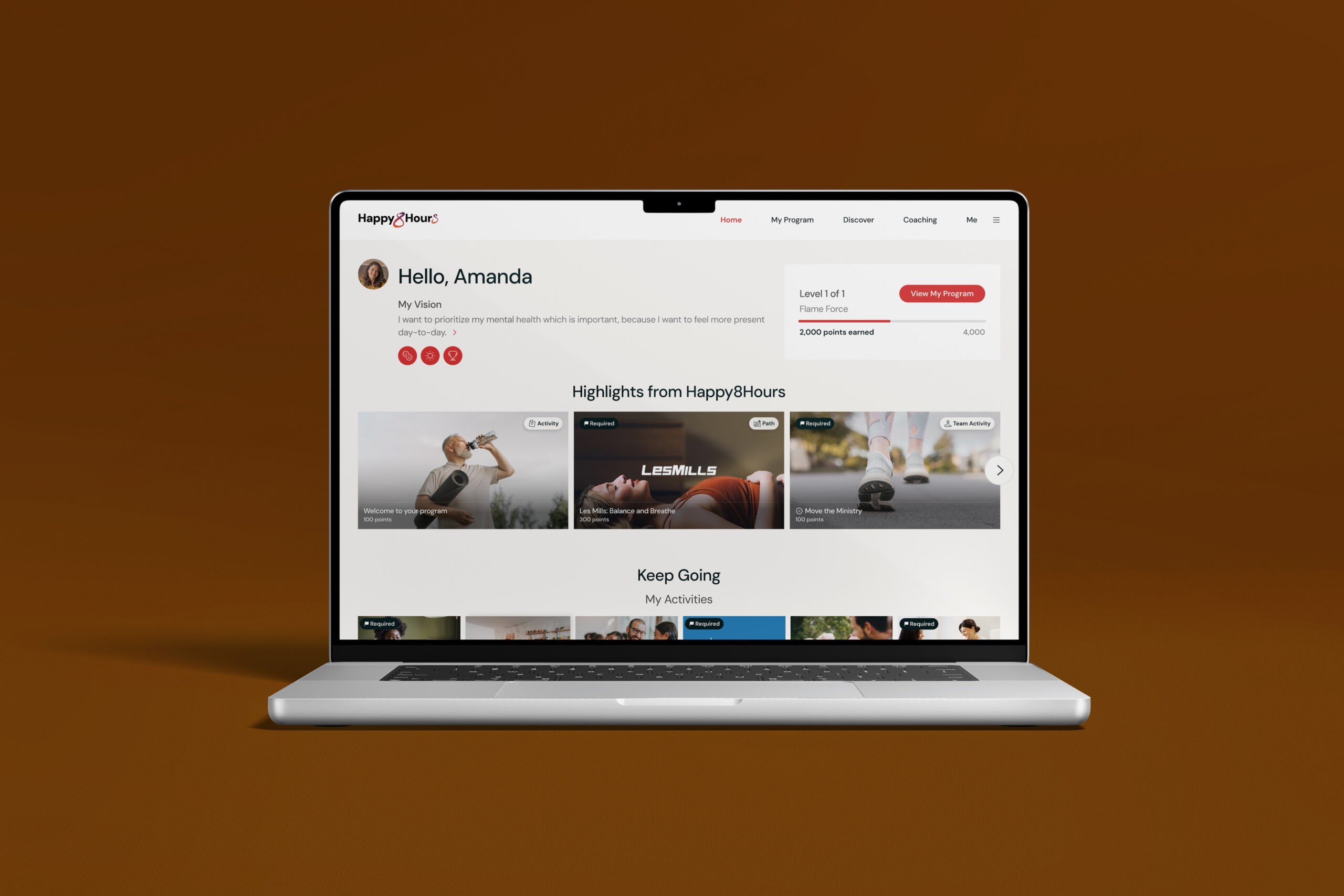
We had multiple problems on the Home page that we wanted to tackle. From user research, I knew that the most evident one was how we displayed Levels and Milestones information. For members, a Levels-only program focuses on earning points and progressing through levels based on overall engagement, giving members flexibility in how they participate without requiring specific actions to advance. A Levels + Milestones program combines point-based progression with required subset milestone actions, guiding members through a more structured journey where certain behaviors or tasks must be completed to unlock the next level.
There was a lack of clarity around all of the information being displayed at a time, resulting in level vs. milestone requirements diminishing each other's value and members not fulfilling needed requirements by deadline.

Suboptimal original designs

New designs: With all of the member's program details being laid out in the My Program page ('View Program' CTA), I took the opportunity to simplify the program snapshot to only need-to-know info
The next problem we focused on was where and how to tackle surfacing earned rewards. When members complete a level, they earn an incentive determined by their employer -- usually a gift card or discounted medical premium. If the gift card isn't redeemed in time, its expiration date prevents the member from ever accessing it. We had no easily accessible way for members to find their earned rewards apart from the email they received upon completion.
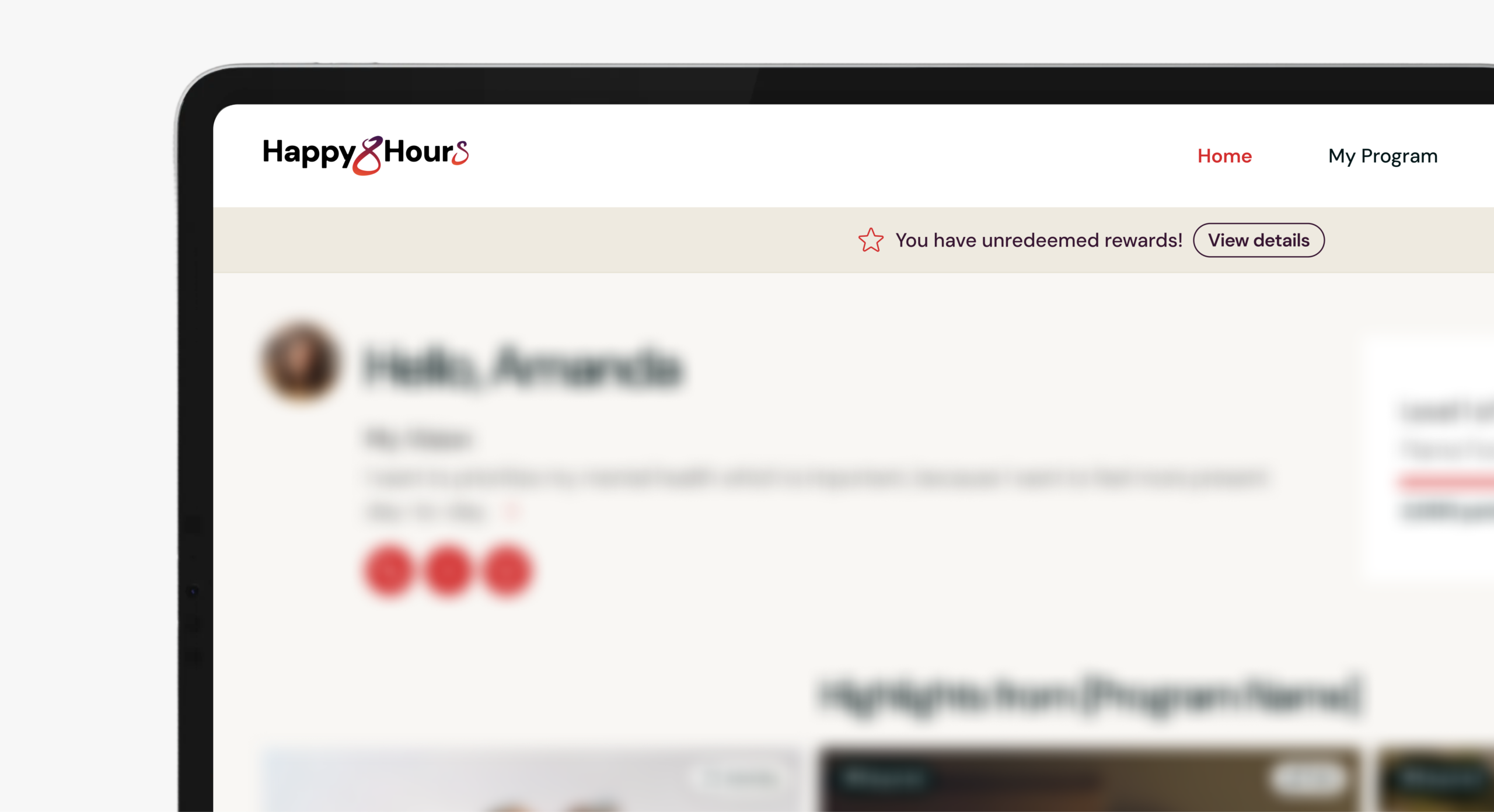
The new designs introduced a banner after a member earns their reward, with a CTA taking them to a net-new Earned Rewards subpage of My Program.
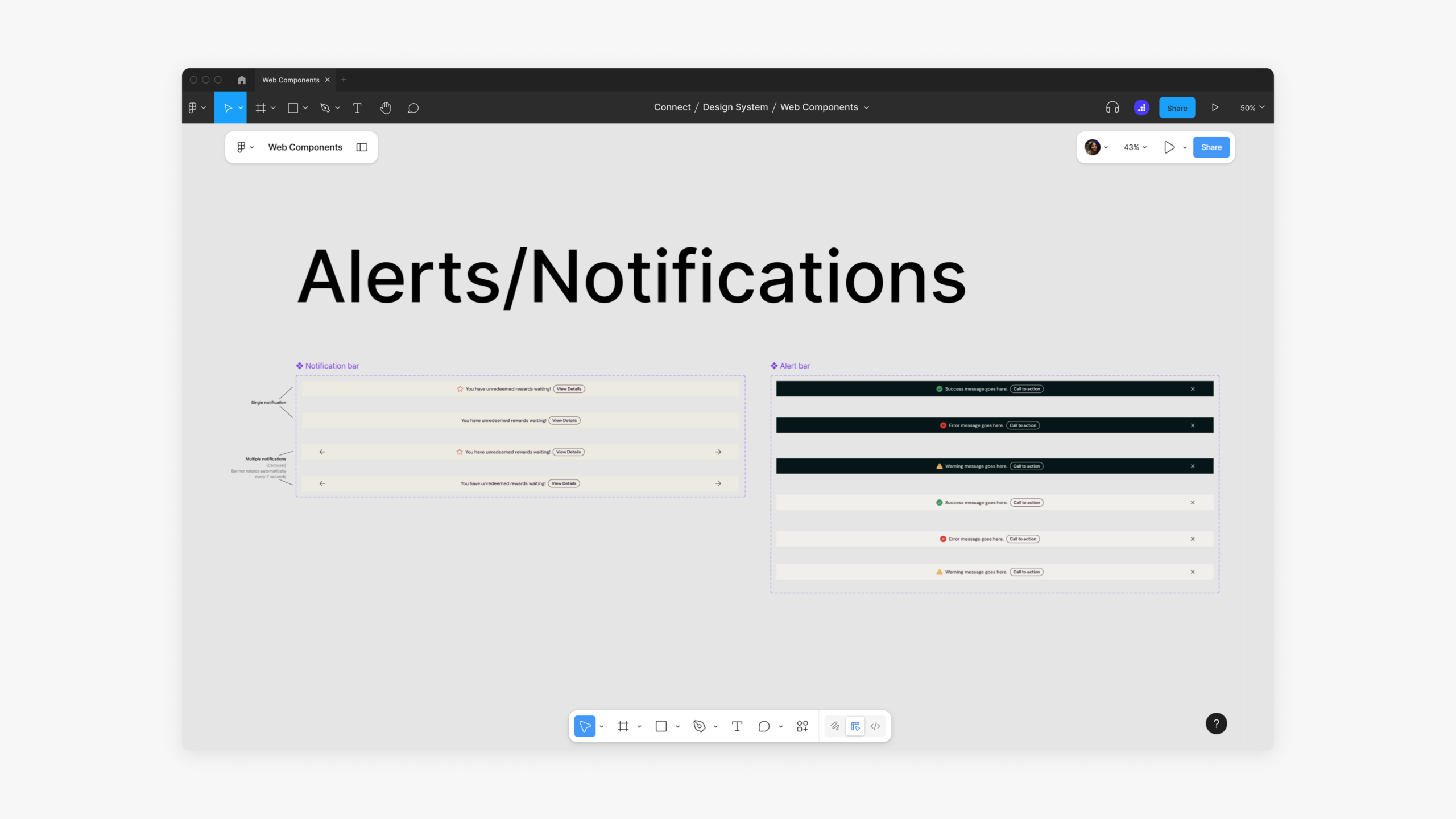
And of course,... we... *in unison* never neglect the design system!
Accessibility Checkpoint
Accessibility was treated as a baseline requirement, not a stretch goal.
THE CHECKLIST
✔ Meets WCAG 2.1 AA standards
✔ Supports keyboard navigation
✔ Uses accessible contrast and tap targets
✔ Scale across desktop and mobile
Influencing Direction
I introduced a single foundational layout direction that represented a significant departure from the existing Connect experience, elevating the platform to a more modern, consumer-grade design standard. Despite the magnitude of change, the direction aligned quickly with Product, Engineering, and executive stakeholders, and the final design shipped with only minor refinements while broader feature expansions were intentionally sequenced into later phases.
Validating Assumptions
Using ProtoPie, I tested interactive prototypes with members to validate the experience ahead of launch. We then rolled out the updated app gradually with a select few internal testers, gathering feedback and refining the experience before full deployment.
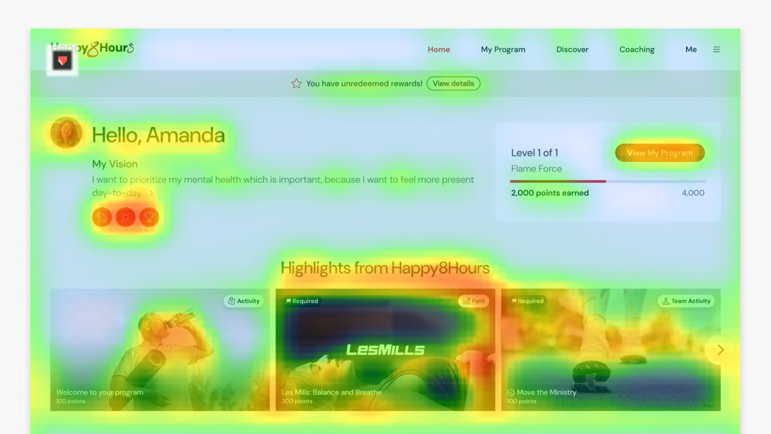
Final Designs
DESIGNS ACROSS DEVICES
The Home page was designed to support Web, iOS, and Android with consistent patterns and responsive behaviors across platforms.
HOVER INTERACTION
Our previous designs felt static and lacked the motion needed to energize the experience. To add quick, lightweight moments of delight, I introduced a subtle hover-to-zoom interaction for content thumbnails.
HORIZONTAL TITLE SCROLL
In my noble effort to slowly rid the world of ellipses, I introduced a single-line horizontal scroll for long titles, paired with a subtle gradient to indicate overflow. This approach preserved readability within constrained tile space while avoiding multi-line wrapping or truncation.
ANIMATED THUMBNAILS
Collaborating with Content and Media Labs to create animated thumbnails was a valuable experience. While seemingly straightforward, aligning across teams and user feedback took time, ultimately resulting in an interactive experience that matched the new brand and user expectations.
INTERACTIVE CAROUSEL ROW
I partnered with engineering to define carousel timing, deceleration, and hover behaviors for the You May Also Like section, powered by AI-driven recommendations that surface relevant Paths and Activities based on member goals and context. This design was inspired by “Because You Watched…” patterns from leading streaming platforms.
A LITTLE HAPPY DANCE FOR COMPLETIONS
Did I mention I really love designing interactions? After an activity is completed, this animation appears once when the member revisits its spot on the Home page, signaling completion while keeping repeatable activities visible, since many reset on a cadence.
REQUIRED ITEMS
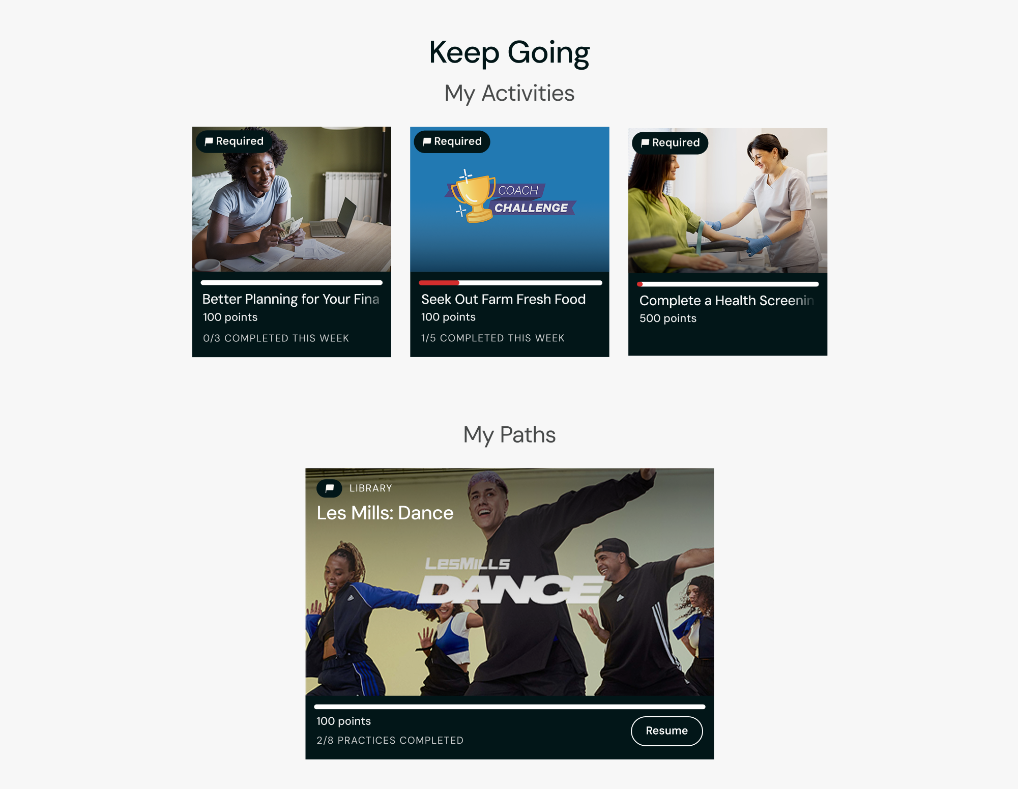
To emphasize actions that require attention, required items now appear under Keep Going by default. A dedicated Home page section for required items is planned for a future release.
TILE STYLE DIFFERENCES
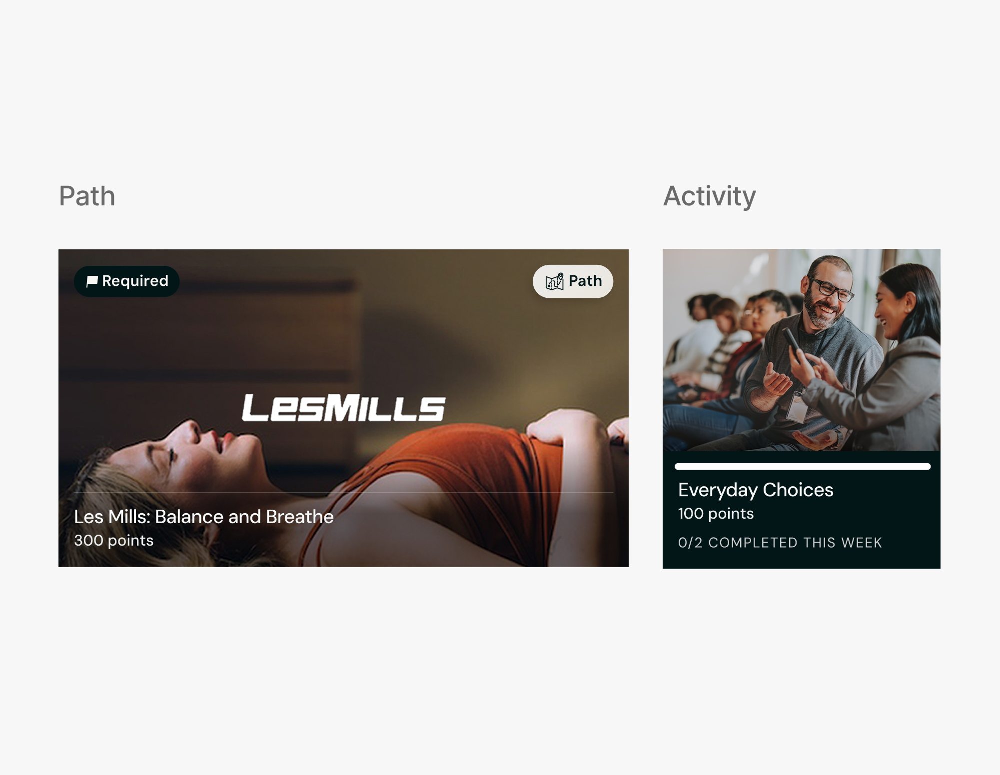
I intentionally varied the tile sizes across My Paths and My Activities to visually signal time commitment, rather than relying on a single size. This approach improved navigation predictability and, through A/B testing, increased the speed at which users found relevant content by 9%.
QUICK COACH ACCESS
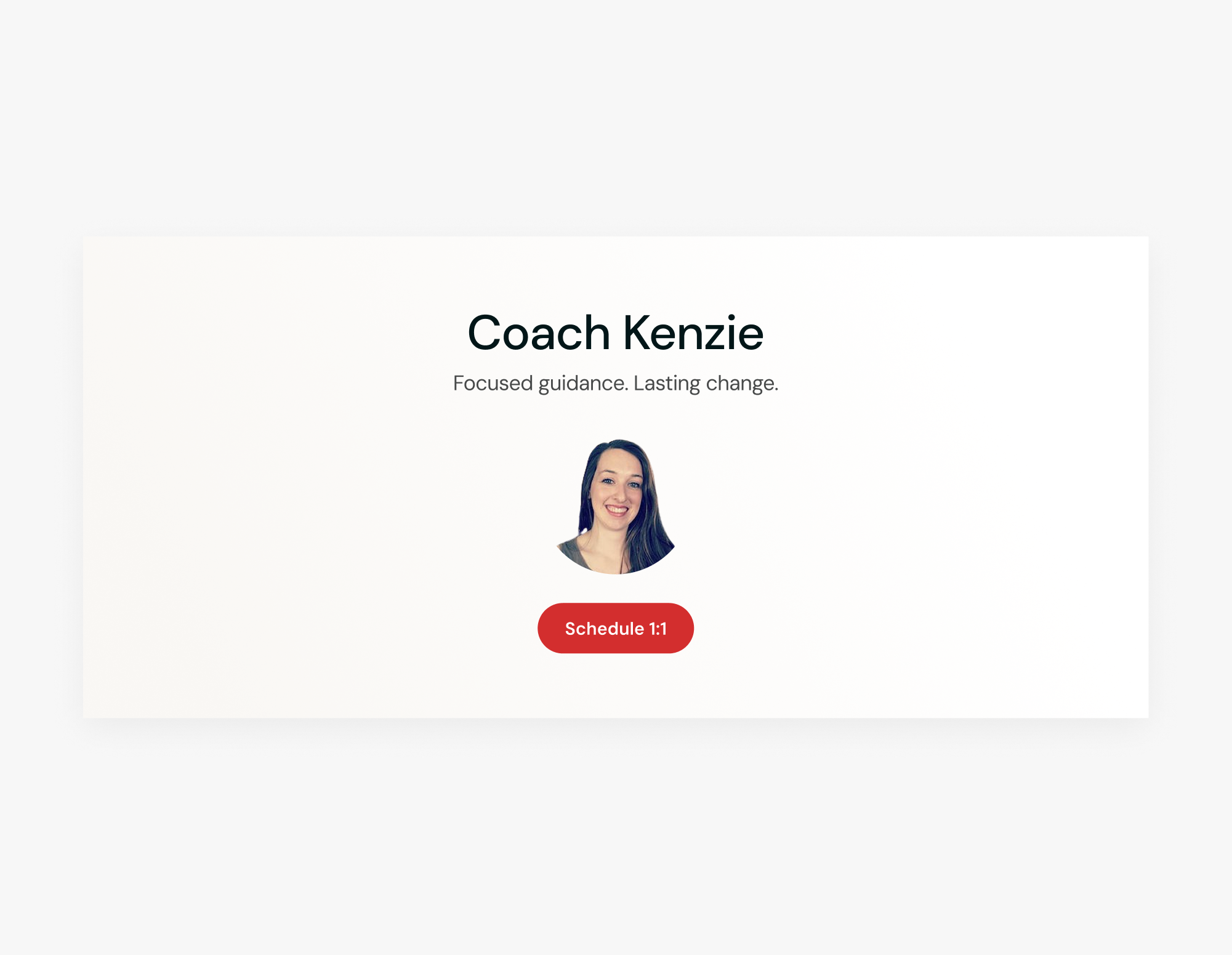
Many members with coach access underutilized the service due to low awareness and a previously hidden CTA. Introducing a dedicated tile—personalized with the coach’s photo—made the offering more visible and the experience feel more approachable.
Next Steps
Early feedback from members and clients has been extremely positive, with higher ratings and improved performance metrics. In early 2026, we began planning Phase 2, focused on deeper biometric integrations and AI coaching capabilities.
Impact
This redesign exceeded engagement targets while establishing a new visual, interaction, and personalization baseline for Connect and Nova AI. Early rollout cohorts showed meaningful improvements in member behavior, satisfaction, and client confidence, validating both the UI direction and the long-term platform strategy.
32%
🠅 INCREASE IN TRACKING ⦿ GOAL: 20%
24%
🠅 INCREASE IN 'RESUME' ⦿ GOAL: 15%
21%
🠅 INCREASE IN WAU ⦿ GOAL: 15%
4.7★
🠅 INCREASE IN APP RATING ⦿ GOAL: 4.3
Engagement metrics measured via tagged Mixpanel events
Let's connect!
Feel free to send me a message or schedule a call! I’m always open to sharing more about my work, showing additional projects, or talking through new opportunities.