Health Screening Options
DEVICE
Desktop
INDUSTRY
Healthtech
AUDIENCE
Organizational employees

SUMMARY
Health Screening Options is a landing spot for Aduro's members to select a biometric screening that uses the results to drive their health program. I was tasked with overhauling the experience as part of a new integration with a third-party diagnostics vendor.
COMPANY
Aduro
DURATION / YEAR
2 months (2023)
STATUS
Shipped
ROLE
Lead Product Designer
CONTRIBUTION
UX · Visual · Research · Testing · Prototyping
Platform Context
WHAT ARE BIOMETRIC SCREENING OPTIONS?
Aduro, a healthtech company specializing in wellbeing solutions for organizations, provides biometric health screenings through their Human Performance platform, Connect. The available screening options depend on the buy-up packages included in the member's employer-sponsored wellbeing program, ranging from in-person to at-home options. The Health Screening Options (HSO) page is heavily accessed by members, serving as the initial step for those needing to understand their health metrics and take proactive steps within the program.
The Challenge
BUSINESS GOALS
Aduro's new collaboration with a third-party health diagnostics center for onsite screenings required updates to our current user interface and program configuration. This initiative was part of Phase 2 of the partnership, involving Single Sign-On (SSO) integration with Quest's Scheduler, enhancements to the Health Screening Options (HSO) page to include this new option, and configuration updates to our enterprise-level tool, Client Center.
PROBLEM
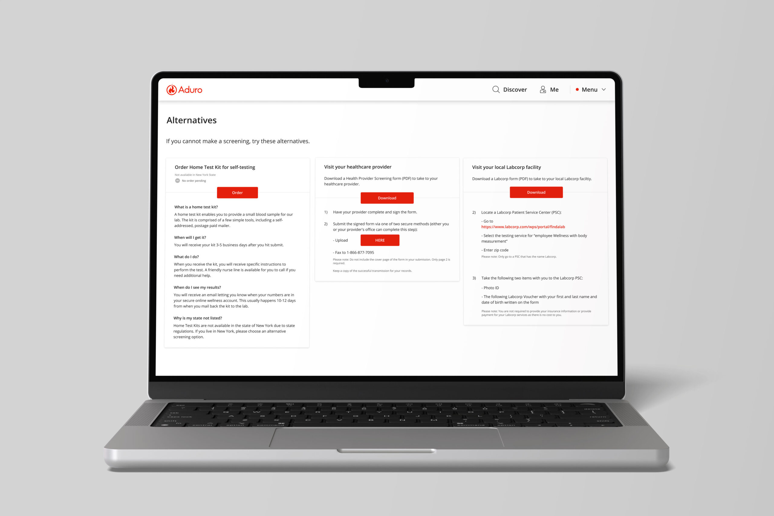
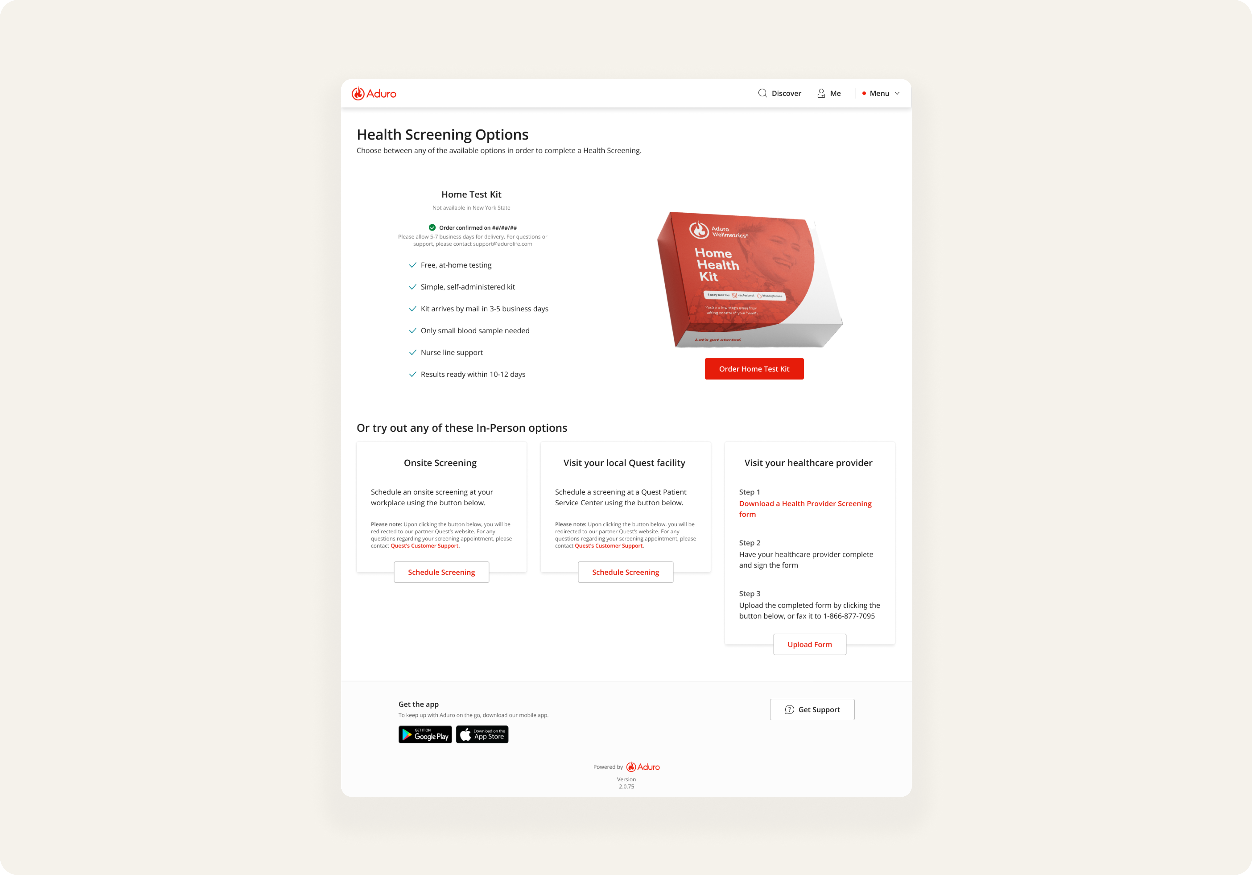
Our HSO layout at the time consisted of three cards side by side, leaving no scalable option for adding a fourth card. Realizing this constraint, I questioned how members would make decisions with more options and whether our current design, with its heavy copy, might cause decision fatigue. Before moving forward, I consulted my team about addressing the entire page design, and was able to influence stakeholders towards expanding scope.
Project Goal
The goal of Phase 2 of the HSO design was simply to introduce a new option for members to complete a biometric health screening. In our current experience, we only had 3 options for members to choose from. This new partnership with Quest would introduce the fourth.
Research
INTERVIEWS
I conducted moderated interviews with members to determine painpoints in the current experience.
Research Synthesis
16 MEMBER INTERVIEWS
20 EXTERNAL USER PROTOTYPE CLICKTHROUGHS
"TOO TRANSACTIONAL / IMPERSONAL"
Members felt intimidated by the current HSO page, stating that they felt like "just another number" or waiting to become "yet another diagnosis". This prevented members from trusting the screening process, either avoiding the page entirely, or increasing the bounce rate.
CONFUSION ON ORDER FORM / STATUSES
"INFORMATION OVERLOAD"
Each health screening option contained way too much information, some not even relevant before making the initial screening decision. This caused decision fatigue and a high abandonment rate for the HSO page.
For options such as HHK (Home Health Kit) and Healthcare Provider, there was no order or form status for members who had submitted their test kits or completed forms. This led to an overall non-intuitive and confusing member experience, as well as 50+ related support tickets per week.
Iterations
ITERATION 1
REASONING
During my own research of the original design, I found a ticket that requested Home Test Kit to be the first option in the line of options, since this brought in the most revenue. After checking with my PM, I continued with this request and made sure to prioritize HTK's place in line.
WHY THIS DIDN'T WORK
Although this solved the problem of keeping our highest revenue-driving option first, it created an asymmetrical layout and less-than-ideal visual hierarchy.
SOME APPROVED CHANGES
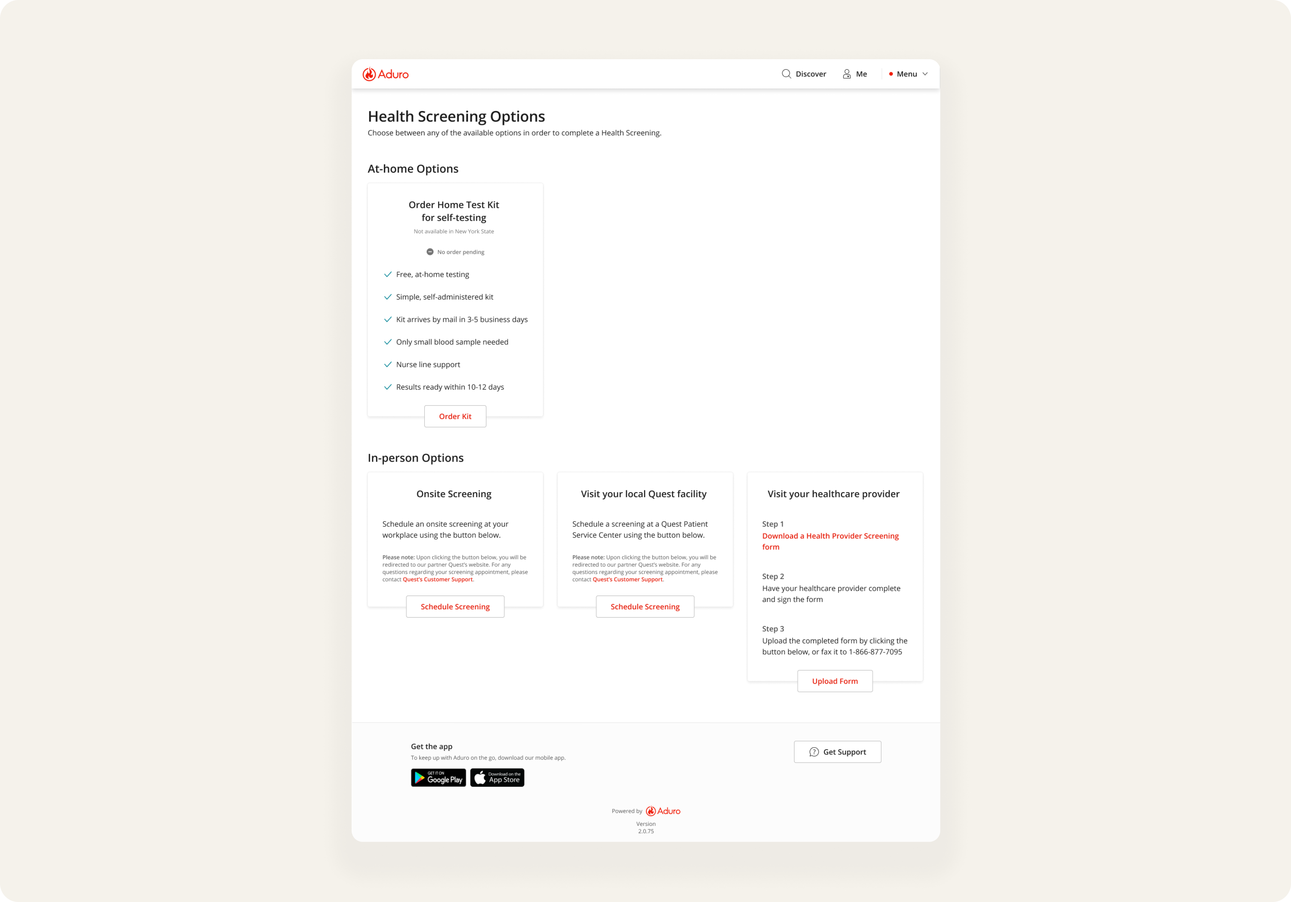
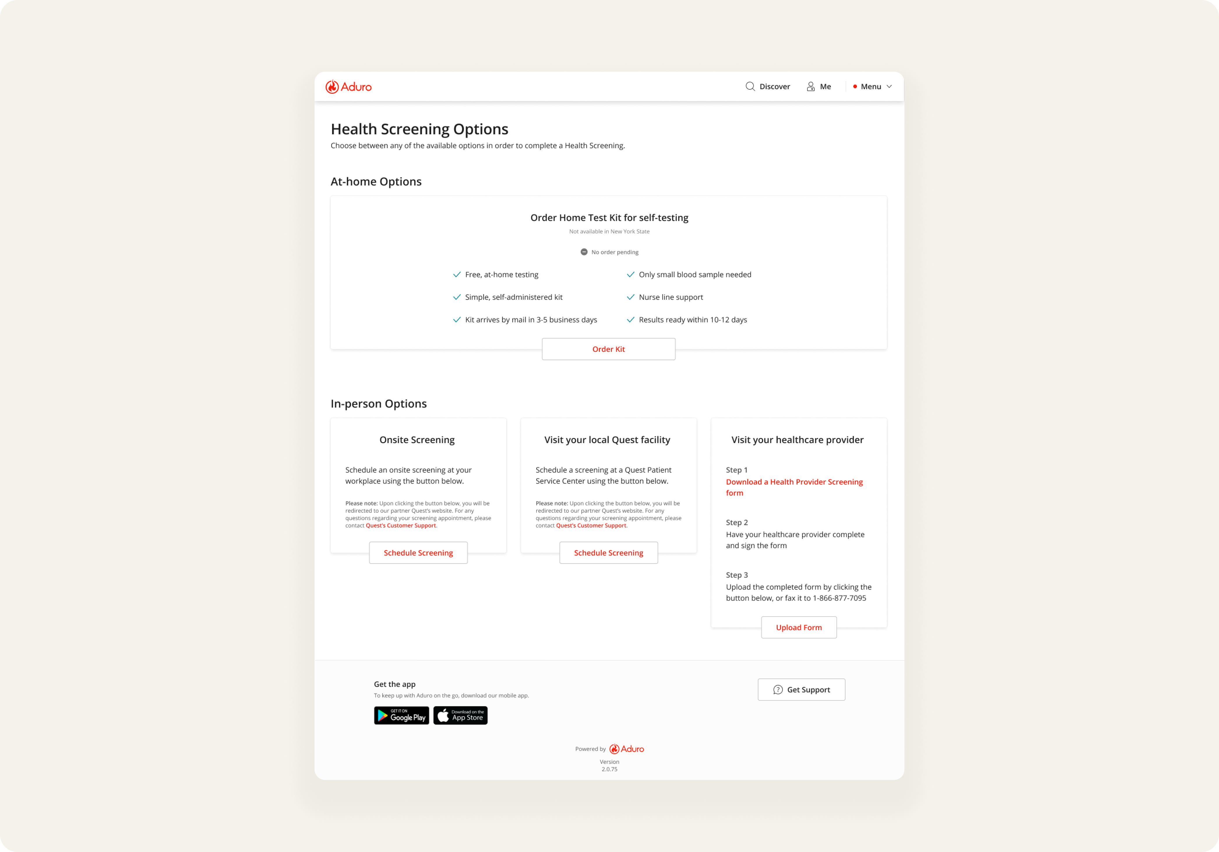
✅ Condensing heavy layout blocks into bullets
✅ Changing title page from "Alternatives" to "Health Screening Options" for clarity
✅ Swapping primary CTA buttons as secondary since there are multiple options
✅ Content copy adjustments for clearer instructions and expectations
ITERATION 2
REASONING
The team felt that we still needed to put some emphasis around the Home Test Kit option, so for my second iteration, I kept it simple: keep what worked in Iteration 1 + add more appeal to Home Test Kit.
WHY THIS DIDN'T WORK
Not all stakeholders agreed that Home Test Kit needed to have such a prominent spot on the page, even with it being a high revenue-driving option. With the test kit image and the primary CTA button, the thinking was that it might overshadow the other options; namely the Quest Facility option, which was our new partnership.
ITERATION 3
REASONING
Since half of our stakeholders supported the Home Test Kit (HTK) as the preferred option, I opted for a more refined approach. I expanded the HTK card horizontally across the top, addressing the excessive white space and disrupted visual hierarchy from Iteration 1. This also reduced the HTK’s prominence while retaining the layout from Iteration 2.
WHY THIS DIDN'T WORK
Most stakeholders preferred this version, so I adjusted my approach of separating rows by name groups. Since HTK would be the only foreseeable choice, removing headers could confuse users, especially with one prominent option at the top. Due to time constraints, we couldn't conduct additional user testing.
Influencing Direction
REASONING BEHIND RESULT
The repeated iterations of the same layout made it clear we were just postponing the real problem. Scalability remained a key issue, so I used this opportunity to stress the member feedback we had gathered to our stakeholders. While the initial focus was meeting the deadline, I successfully guided the project in a new direction based on the data I presented.
Research-backed Solutions
PAIN POINT:
TOO TRANSACTIONAL/IMPERSONAL
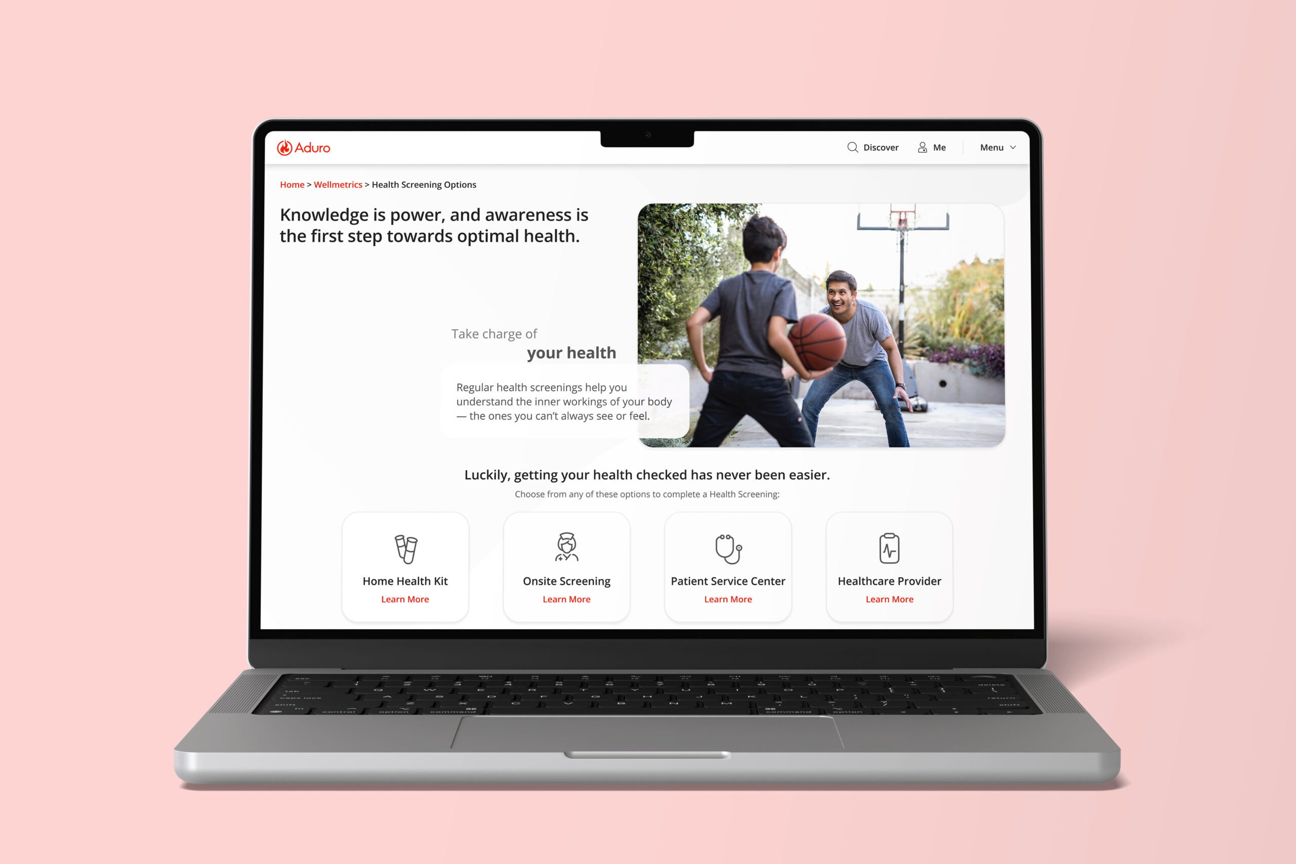
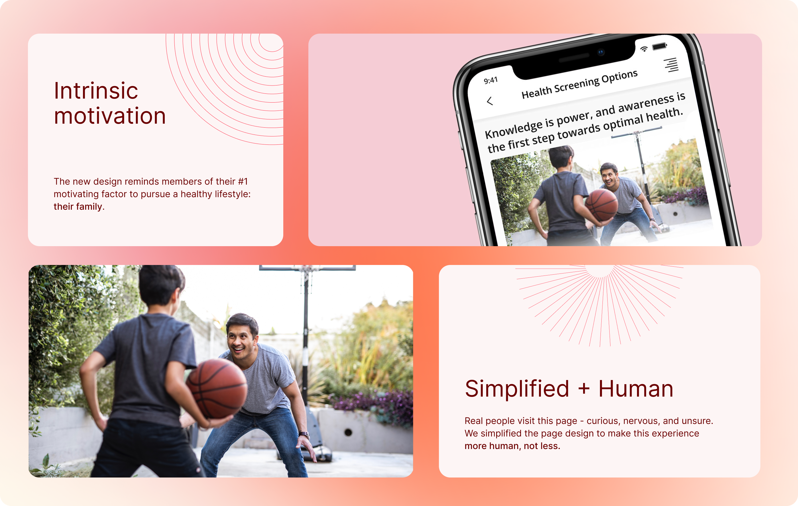
With our users in mind, I started by adding a father/son image to the top of the page to invoke intrinsic motivation for our members to make lifestyle changes. Many members with children and spouses had expressed that family is their biggest motivator for addressing health concerns in a timely manner, or at all.
PAIN POINT:
INFORMATION OVERLOAD
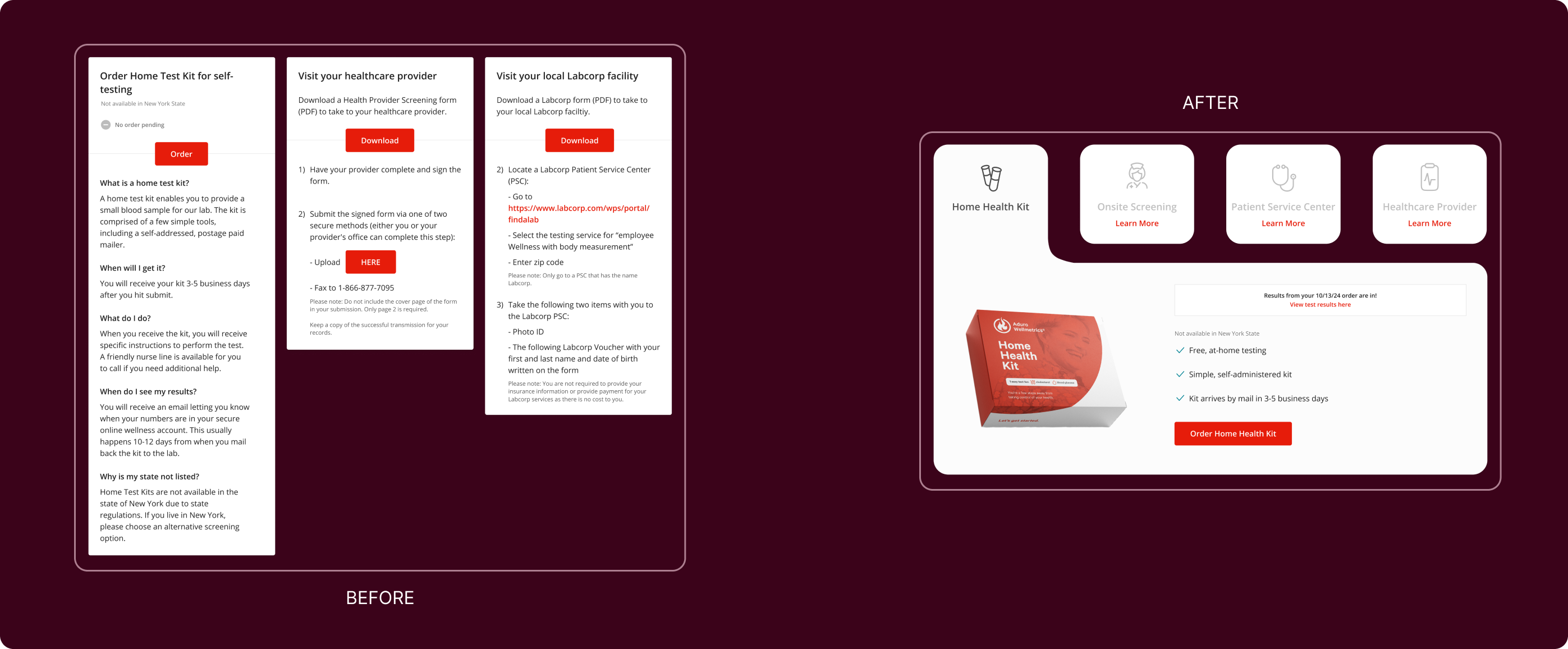
I simplified the content of each card with bullet points for key facts and added interactive collapse/expand views. This maximized space and reduced decision fatigue by showing one option at a time.
PAIN POINT:
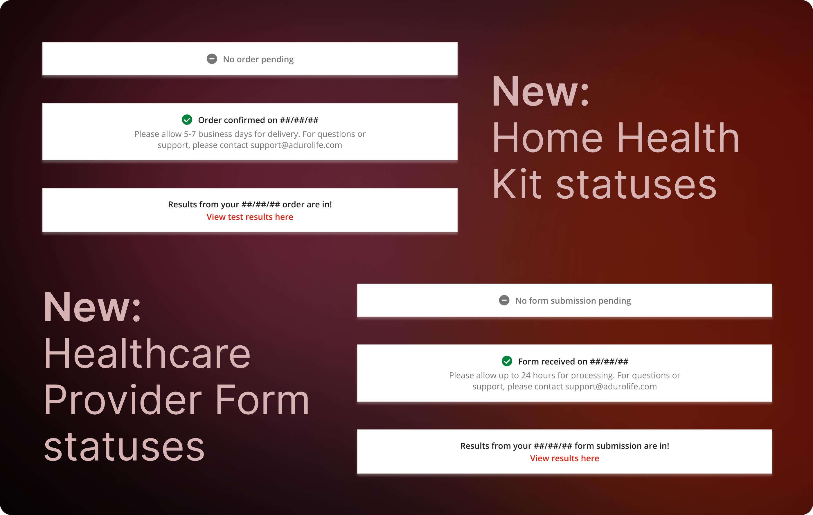
ORDER / FORM STATUS CONFUSION
Since an Order Status page was out of scope for v1, I expanded the status types for Home Health Kit and Healthcare Provider cards to keep members informed of their order/form statuses throughout the process.
Impact
The most notable change with this design was the significant increase in members completing health screenings, including form uploads, HHK submissions, and in-person appointments. Client Experience Managers reported that their clients praised the design's intuitiveness and visual appeal, which encouraged greater member participation.
28%
🠅 INCREASE IN COMPLETED HEALTH SCREENINGS