Enterprise Platform Login Redesign
DEVICE
Desktop
INDUSTRY
Healthtech
AUDIENCE
Client Experience Managers
SUMMARY
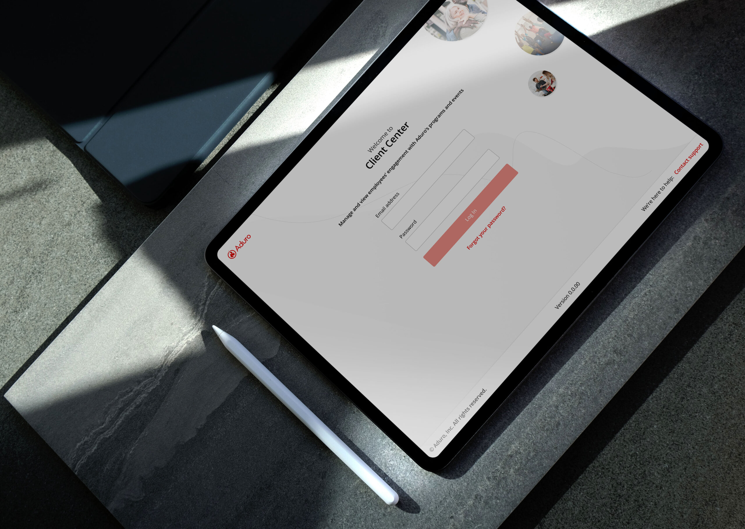
Client Center, an internal application, was ranked our #1 most requested product for external client access for CEMs and CEAs to manage their company's wellbeing program. I redesigned the platform, beginning with a new client login page.
COMPANY
Aduro
DURATION / YEAR
2 weeks (2023)
STATUS
Shipped
ROLE
Lead Product Designer
CONTRIBUTION
UX · Visual · Research · Testing · Prototyping
Platform Context
WHAT IS CLIENT CENTER?
Client Center is an internal platform that enables Aduro's Client Experience team to configure and manage the day-to-day operations of external clients' wellbeing ("Human Performance") programs. These programs are supported by another one of Aduro's platforms: Connect, which is used by the employees of these clients' organizations to interact with their program.
The Challenge
PROBLEM
Despite providing interim solutions through Sisense for clients to access employee program insights, the lack of access to Client Center led to hundreds of manual hours for our internal teams supporting program management. Clients also faced indefinite wait times as our CEMs/CEAs made program changes on their behalf.
SPENT RESOURCES
5-10 manual hours
(per week, per CEA)
10-20 manual hours
(per week, per CEM)
Project Goal
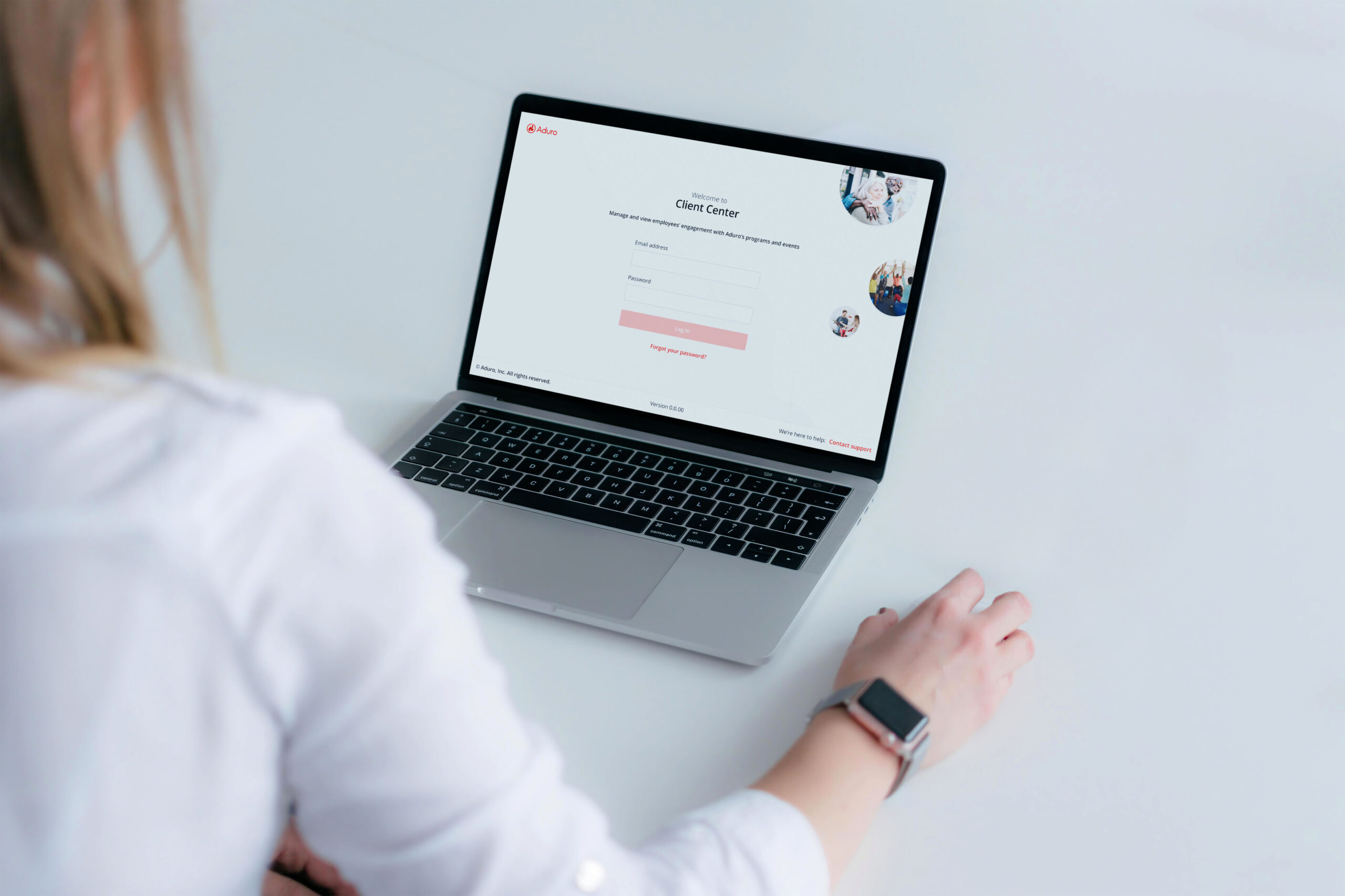
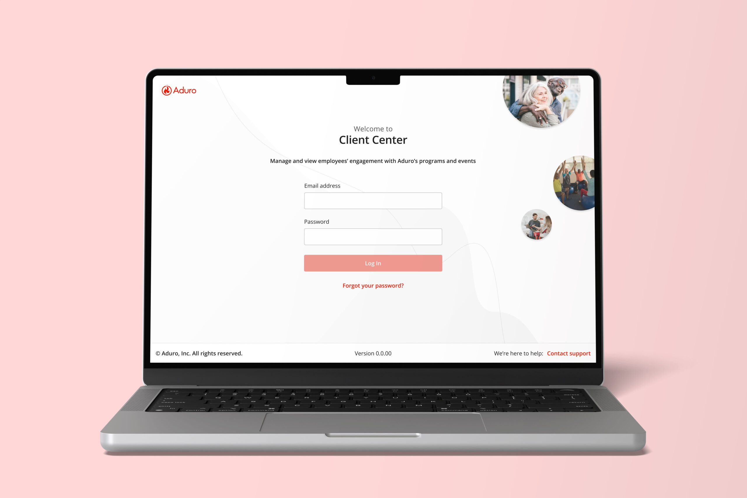
The goal of this initiative was to restructure and redesign Client Center for external CEMs/CEAs to finally be able to manage their company's Human Performance program. This initiative began with redesigning the login page.
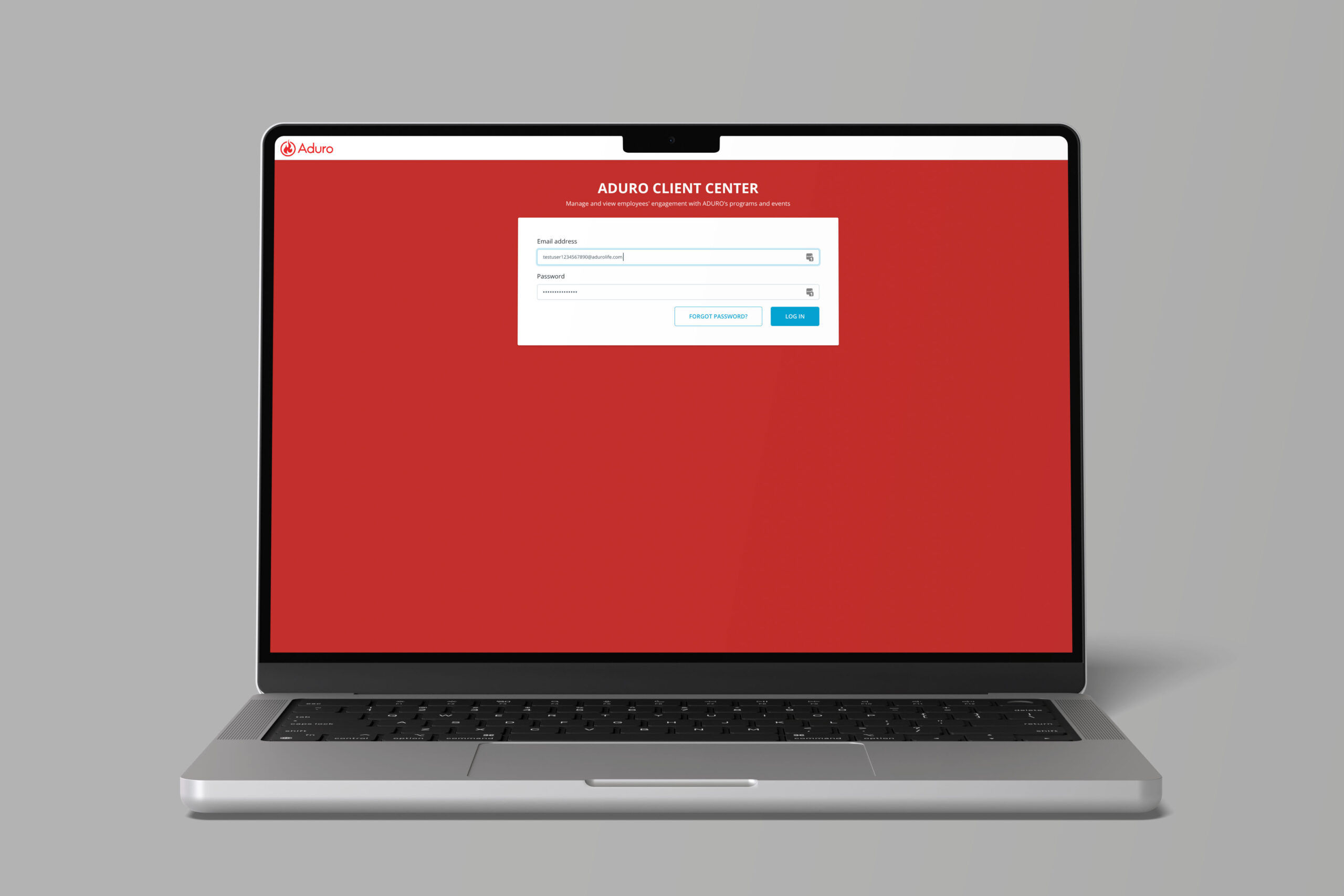
Split Testing
Since the functionality of the existing login page was sound, we only performed A/B testing of the legacy design against my new design, with several of our volunteered clients. Our team performed a UX heuristic eval to ensure a non-buggy performance.
Visual Marketing
20 EXTERNAL USER PROTOTYPE CLICKTHROUGHS
Sifting through thousands of our Content Marketing library artifacts, I leveraged my branding and marketing background to find the right images for this project.
Image criteria based on population demographics:
· A REPRESENTATION OF EMPLOYEE WELLBEING
· COMMUNITY / TOGETHERNESS
· DIVERSE ETHNICITIES
Design System: Element Overhaul
SAYING GOODBYE TO A LEGACY 'SQUIGGLE'
An audit of our marketing materials revealed that the current graphic elements were outdated, overly playful, and no longer aligned with Aduro's brand message. Given the scope of the remaining work, I took the opportunity to redesign the legacy "squiggle" element, offering clients a refreshed branding experience.
THE SQUIGGLE'S REPRESENTATION
The squiggle is a graphic element that represents the Human Performance journey – never linear, and always adapting to its surroundings.
WHY DOES IT MATTER?
A consistent brand builds trust and equity with clients, prospects, and participants, so every element must be carefully considered. The redesign of the login page was just the start; it led to a larger project—redesigning the entire Client Center platform. After auditing the system, I found that much of Client Center was outdated, with the UI neglected for years. As we granted clients new access, it became crucial to establish branding for the updated interface early on.
A NEW DIRECTION
I presented the new login design and proposed removing the outdated squiggles from all content, including product videos, communications, graphic designs, and micro-content—a significant task. After discussing the issues with the team, they agreed the change was essential for the brand’s direction. And so, the new Client Center interface was created!


Left (Before) – too playful, directionless, unpredictable
Right (New design) – subtle, organic movement with ups and downs. Following a path of direction, though sometimes veering off and returning – representative of intentional life and habit changes
Impact
No tags were assigned to the outcomes of this design project in Mixpanel, but numbers aside, our clients continue to rave about the "clean, aesthetic look" of Client Center today.
🠅 INCREASE IN INTERFACE SATISFACTION/APPROVAL